Semiotika ISSN 1392-0219 | eISSN 2424-547X
2023, vol. 18, p. 199–235 DOI: https://doi.org/10.15388/Semiotika.2023.7
Sensory Qualities as Signs? Meyer Schapiro as a Pioneer of the Semiotics of ‘Visual Form’
Fred Andersson
Åbo Akademi University, Finland
E-mail: franders@abo.fi
https://orcid.org/0000-0002-9161-5136
Summary. The concept and nature of Form in linguistic as well as visual signs has been debated among several semioticians and art historians. Some notable analytical attempts have been put forward by Saussure, Hjelmslev, Vygotsky, and, regarding visual signs in particular, by Meyer Schapiro, Floch, Greimas, and the Groupe µ, among others. Greimas and Floch proposed a distinction between two levels of semiotic Form in visual representation, each being constitutive of a separate system of semiotic articulation: figurative language and plastic language. With arguments drawn from behavioural science, the interdisciplinary Groupe µ presented a different version of the same distinction as one between iconic and plastic signs.
In this paper, I shall give a short outline of these and some further proposals, especially Meyer Schapiro’s view on the formal structure of pictures and visual signs, and his analysis of visual signifiers as ‘vehicles’ of spatial meaning. Schapiro’s account of the ‘image-sign’ will be presented as coloured by his socio-historical perspective and the empirical pragmatism of Peirce. Regarding the relationship between ‘iconic’ and ‘plastic’ meaning, Schapiro’s studies of Romanesque sculpture and non-figurative painting anticipate some observations later made by the Groupe µ. However, rather than attempting to defend any specific account of the nature of visual or plastic Form, a pluralistic position will be proposed here.
Keywords: plastic language, Algirdas Julien Greimas, Jean-Marie Floch, Groupe µ, Meyer Schapiro
Received: 17/11/2023. Accepted: 10/01/2024.
Copyright © 2023 Fred Andersson. Published by Vilnius University Press. This is an Open Access article distributed under the terms of the Creative Commons Attribution Licence, which permits unrestricted use, distribution, and reproduction in any medium, provided the original author and source are credited.
The objective of this article is to attempt an evaluation of the chief contributions to a semiotics of the plastic dimension of pictures and other visual signs, and to draw attention to the art historian Meyer Schapiro as an early pioneer of such studies.1 A less specific name for the semiotics of the plastic dimension is the ‘semiotics of visual form’, but art historians and semioticians tend to use the notion of Form quite differently. When art historians analyse paintings and other categories of pictures and visual art, they mean by Form the lines, contours, shapes and volumes that are the carriers of a pictorial Content. Sometimes they need to specify whether they use Form only in the sense of linear form (shapes and volumes) or in the much wider sense of “form and colour”. For a semiotician, on the other hand – and especially for semioticians who belong to the linguistic tradition of Saussure and Hjelmslev – Form is rather a function that characterises both the carrier that expresses the sign and the content that is expressed by the sign. The hjelmslevian way to explain this is that the “form of expression” in each sign is a set of distinctive features that are necessary for expressing a certain Content, and conversely that the “form of content” is the range of semantic characteristics that are being expressed.
For the sake of transparency, we may recapitulate how this linguistic model can be exemplified and applied to pictorial examples. In English, the word MAN is a linguistic carrier (M-A-N) whose Form cannot be changed at random (for example not into C-A-N) and which on the Content level corresponds to the following semantic units or semes: human, masculine, a singular instance. If the carrier is instead changed into FARMERBOY we get a more specific set of semes: human, masculine, young, rural, a singular instance. By means of a simple analogy, we may then claim that a picture with a necessary amount of detail can denote the Content FARMERBOY, but if it is abstracted into a simple visual scheme it will only denote MAN. On the Content side, the simplified visual sign will denote a more narrow and abstract range of semes.
However, the big difference between the linguistic sign and the visual sign concerns the plane of the carrier or, in the parlance of Hjelmslev, the Expression (Danish, udtryk). The formal properties expressive of the basic seme “human” are retained in both the detailed and the schematic variety of the visual sign. In the linguistic sign, the basic features of the Expression – that Hjelmslev referred to as figuræ – have no independent meaning in themselves. In each language, they constitute a limited set of grammatical units or formants that are combined and associated with related semantic contents in an arbitrary and non-motivated fashion. In the visual sign, on the other hand, each element (point, line, shape etc.) may retain or change its meaning depending on its function as a part of a perceptual whole, and there is no fixed threshold below which a segmentation will yield elements that totally lack meaning in relation to the whole.2
1. Visual semiotics between ‘conventionalism’ and ‘cognitivism’
The notion of semiotic form, established by Saussure in Cours de linguistique générale, stresses the immaterial aspect of the linguistic Expression or Signifier. In Saussure’s famous example, form is to substance as the daily train route from Geneva to Paris is to one specific train that leaves at 8:45 on a specific day (Saussure 1972: 151). Regarding the phenomenological status of the Signifier (signifiant), Saussure is particularly clear in his Cours: even though it is materially transported from speaker to listener by means of sound waves, or as graphic tokens of writing, it is not to be regarded as a material phenomenon. It is an image acoustique, an inner or mental ‘sound image’, recognized and apprehended in an identical fashion by speaker and listener (Saussure 1972: 28). It represents the semiotic Form of the word, i.e. the whole word, which we don’t tend to break down into syllables and phonemes when we memorize a word or learn a language (Saussure 1972: 98). Sociologically speaking, then, a sign is a mental scheme or type that is repeated and therefore understood within a certain community or culture, irrespective of various idiolects and sociolects.
Saussure’s Cours, first published in 1916, marked the beginning of structural linguistics as an alternative to earlier, philological language theories. Later, Louis Hjelmslev added clarifying methodological specifications and terminological innovations in his Prolegomena to a theory of language, first published in Danish in 1943. Hjelmslev’s influence in the context of francophone Structuralism is the standard tale of how modern semiotics and visual semiotics came into being in Europe: Roland Barthes introduced sémiologie as an essentially hjelmslevian discipline and proposed a ‘rhetoric of the image’ that was explicitly based on such notions as denotation, connotation, syntagmatics and paradigmatics.
As a Jewish-American intellectual, active on another continent and before the publication of Hjelmslev’s Prolegomena, Meyer Schapiro was bound to adopt a rather different approach to signs, language and pictures. Having completed his doctorate at Columbia University in 1929 with a thesis on Romanesque sculpture, his Marxist approach to the social history of art drew him into radical intellectual and artistic circles in New York (Persinger 2007: 71–89). But the philosophy and ideology that dominated both the United States and Columbia University at the time was that of American Pragmatism, originating in the work of Charles Sanders Peirce. Still today, the distance – both conceptually and geographically – between those semioticians who adhere to the logic and semiotics of Peirce, and those who belong to the ‘European’ tradition of Saussure and Hjelmslev, is sometimes striking. Limited language skills and a lack of access to other texts than those translated into English has long hindered and delayed intercultural dialogue between anglophone and non-anglophone scholars in the field.
Another pioneer of semiotics, whose doctoral thesis from 1925 on the psychology of art was not published in English until 1971, was the Soviet linguist and psychologist Lev Vygotsky. In his reflections on visual art, Vygotsky invokes a theory of Form that is rather different from that of Saussure and much closer to the philology of Wilhelm von Humboldt. For Humboldt and for Vygotsky, the ‘outer form’ of a word is its phonetic existence as sound. The ‘inner form’ is constituted by an etymological, collective memory of a basic or nuclear meaning that the word has or used to have. However, this inner form is not necessarily identical or even similar to the actualised meaning or significance of a word. For example, the Russian word for mouse once signified ‘thief’ – the nuclear inner form being the idea of a vice shared by certain animals and certain men (Vygotsky 1971: 30). Meyer Schapiro echoes this philological notion of inner form in a celebrated text on artistic style, arguing that ‘style is a manifestation of the culture as a whole, the visible sign of its unity’, and ‘style reflects or projects the “inner form” of collective thinking and feeling’ (Schapiro 1998: 143).
If this conception of ‘inner form’ is taken at face value, it differs from Saussure’s image acoustique in at least one crucial respect. The ‘inner form’ of a visual style that reflects collective thinking is not something that exists only in the mind. It is the result of social processes and changing material circumstances – it has a history, and it embodies its concepts. Both Schapiro and Vygotsky shared an historicist approach that was partly motivated by their Marxist inclinations. A comparison between their notion of Form and that of Saussure reveals a parting of ways that is not merely ideological but rather indicative of a more fundamental disagreement concerning the philosophy of language. It is a disagreement that has determined and structured much of the debates in visual semiotics. On the one hand, there are those who tend to believe that language determines the way we perceive the world, and by the same token the way we perceive and interpret visual images. On the other hand, there are those who consider sensory perception to be the basic source for semiotic processes and the generation of meaning, and that it is more than likely that the structure of human natural language reflects the structure and order of the lifeworld, at least to some extent. For the latter group of scholars, the primacy of perception does not necessarily rule out a recognition of time-specific and cultural conventions of pictures and picture making, but they tend to stress that visual meaning must be approached in a manner different from the study of language.
The standpoint represented by the first group is reminiscent of Scholastic nominalism – the belief that universals or general concepts have no real existence in the world. For a nominalist, general concepts are merely mental projections of language, a grid that categorizes and orders unique objects and instances with no properties in common. To be a nominalist does not necessarily imply that one believes images to be structured the same way as language – notably, the philosopher Nelson Goodman was a decided modern nominalist who in his Languages of Art stressed that representational art is distinguished from differentiated or modular structures by being ‘dense’. We may here speak of different degrees of nominalist, linguistic or psychological conventionalism. Thus far, it is semiotic theories of this type that have had the strongest impact in the field of art history, especially during the era of Post-Structuralism and ‘new art history’ in the 1980s and 1990s.
Among anglophone art historians active during this era, Norman Bryson stands out. In his first major work, Word and Image: French Painting of the Ancien Régime (Bryson 1981), he proposed a rereading of Western art history based on the opposition between discourse and figure – notions derived from the aesthetic philosophy of Jean-François Lyotard. Stressing, in accordance with earlier contributions by Louis Marin, that pictures are ‘read’ as a discourse that confirms to a certain cultural ‘paradigm’, Bryson proposes that this discursive activity stands in a dialectical relationship to figure. He defines figure as ‘those features which belong to the image as a visual experience independent of language – its “being as image”’ (Bryson 1981: 6). This solution leaves the fundamental problem of the relationship between cultural coding and sensory perception unresolved – on the one hand we have the discursivity of the Western tradition of narrative history painting, on the other a sensory ‘being as image’ that remains ineffable and unstructured.
Much less known and read by contemporary art historians are treatises and papers published by other ‘schools’ of visual semiotics – schools that are influenced by gestalt psychology, by cognitive science, and also to some extent by Peircean semiotics and logic. Starting in the 1970s, three such schools have emerged in Canada, Belgium and Scandinavia: the Quebec school of Fernande Saint-Martin and Marie Carani, the Liège school of the interdisciplinary group of scholars that refer to themselves as Groupe µ, and the Lund school of cognitive semiotics, founded by the late Göran Sonesson. However, the latter two schools long developed in a parallel and interrelated fashion. A fourth school, older than the others, occupies a mixed position concerning its attitude to structural linguistics and pictorial conventionalism. It is the francophone Greimas school, basing itself on the generative semantics and narratology of the Lithuanian-born French semiotician Algirdas Julien Greimas. The generative approach of Greimas has been of immense importance for both narratology and visual semiotics. The credo of Greimas was that we experience the world as already semiotically structured. Our perceptions, conceptions and stories have a generative origin in universal, oppositional categories, recognized by cultural anthropologists: nature vs culture, heaven vs earth, man vs animal, animate vs inanimate.
Followers of Greimas tend to keep behavioural science and Peircean influences at a distance, but their contributions to visual semiotics are not ridden with the same difficulties as earlier, more dogmatically Structuralist attempts. The publications that resulted from the visual semiotics workshop at EHESS in Paris, led by Jean-Marie Floch but inspired and advised by Greimas, marked the beginning of visual semiotics as a more organised and systematic enterprise. The second major breakthrough was accomplished by Groupe µ in their Traité du signe visuel (1992) and anticipated by Göran Sonesson in his Pictorial Concepts (1989). In the following two sections, we will therefore focus on the methodology developed by the Greimas school and the Liège school, respectively.
2. Floch’s analysis of Kandinsky’s Composition IV, and some criticisms.
An important document of the development of the Greimas school is Greimas’ own conclusions from the visual semiotics workshop, printed in French in 1984 and in English in 1989. There, Greimas elaborates on the reasons for his choice to avoid Peircean terminology and define the representational function of pictures as figurative, not iconic. According to Greimas, two-dimensional depictions cannot be iconic, because ‘The “features” of the world – traces and tracks – […] selected and transposed onto a canvas are really nothing very much compared to the richness of the natural world. They are perhaps identifiable as figures, but not as objects of the world’ (Greimas 1989: 631). Greimas here refers to figures in the hjelmslevian sense of figuræ (introduced above) and not in the sense used in the context of rhetoric. His argument presents an analogy between phonetics and visual processing. The elements of two-dimensional depiction are comparable to phonetic figuræ, with no iconic relation to the real world, but in the process of perceiving a scene and transferring it to the flat surface they are organised by means of a reading grid: ‘The reading grid, which is of a semantic nature, solicits the planar signifiers and, bringing under its wing the bundles of visual features which vary in their respective densities and which it makes into figurative formants, endows them with signifieds.’ And Greimas adds: ‘It thus transforms visual figures into object-signs’ (Greimas 1989: 633).
Like most other scholars in his social circles, Greimas was deeply influenced by Hjelmslev’s Prolegomena. In the 1960s, it was only available as a partial French translation, based on the earlier English translation, but Roland Barthes´ Éléments de sémiologie (1964) defined French Structuralism as an essentially hjelmslevian movement. Unfortunately, Barthes early, essayistic analyses of pictures have inspired quite distorted versions of Hjelmslev’s original ideas. Bryson’s Word and Image may be quoted as an example of this. Greimas, on the other hand, learnt to cherish Hjelmslev’s novel conception of the Signifier. For Hjelmslev, the Signifier is not only Form, or an image acoustique, but also Substance and Matter. It involves the repetition of a constant Form, but it is also subject to individual variation, and its enunciation occurs in specific situations.
The topic of visual semiotics gives Greimas occasion to stress the material and situated dimension of enunciation. The visual figures and formants are material (pigment or ink on a surface), but so are the objects in the real world. Moreover, the real world is already structured by the reading grid: both the figurative signs and the objects that serve as their models are object-signs. This idea has disturbed some of Greimas’ critics. Paolo Bertetti writes that ‘a sign should not be considered a material element, as Greimas argues, but rather as an immaterial entity, as Saussure suggests, where it is virtually present only in the memory of the culture and actualized from time to time in texts (that are material)’ (Bertetti 2017: 95).
Indeed, it was their recognition of the materiality of the signifier that guided both Greimas and the members of Groupe µ into an awareness of sensory perception as a source of meaning. The collective from Liège had an interest in empirical science that was not shared by Greimas and his students, but both schools recognized the possibility that the sensory qualities of images may carry semantic values of a different kind than iconic or figurative signs. They developed theories of the plastic semiotic layer (or language, or sign) at roughly the same time. The analytical plastic categories defined by Greimas and Courtès in Dictionnaire raisonné de la théorie du langage (1979) and by Groupe µ in their Traité are similar enough to be summarized in the flowchart shown in fig. 1, derived from Traité.
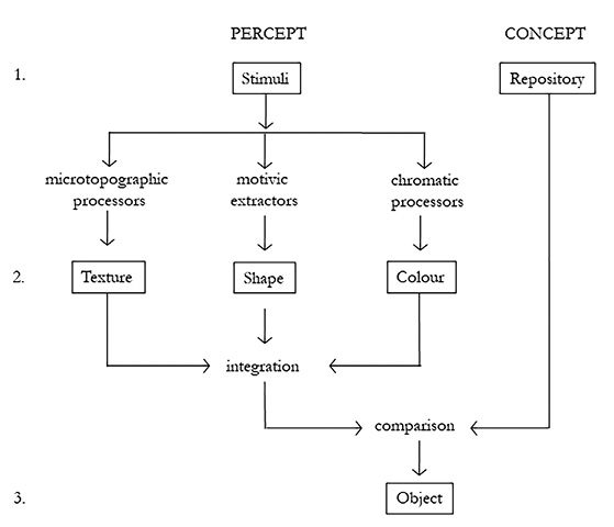
Fig. 1. Conceptual flowchart, adapted by the author from Groupe µ 1992: 91 table II.
Percepts are processed by neural mechanisms that Groupe µ refers to as microtopographic processors, motivic extractors, and chromatic processors. The results are perceived textures, shapes and colours, corresponding to the elements that Greimas and Courtès term topological, eidetic and chromatic. (Differently from Groupe µ, Greimas and Courtès regard chromatic elements as ‘constitutive’ and eidetic elements or shapes as ‘constituted’.) At this second level, the elements are integrated into unified percepts that are mentally compared to a repository of stored concepts.3 The final output is the recognition of objects – compare Greimas’ notion of a reading grid. There is nothing in this account that suggests that perceived or depicted objects are merely copies of objects in the real world. According to Groupe µ, they correspond to stored concepts that Groupe µ also, borrowing a notion from cognitive psychology, refer to as Types. These Cognitive Types (CT) can be hierarchical relationships between parts and wholes that on the iconic level constitute the recognition of for example MAN or FACE, but they can also be abstract properties associated with plastic signs, such as ‘balanced’ vs ‘unbalanced’, ‘roundness’ vs ‘angularity’. (Groupe µ 1992: 97-99).
In a celebrated analysis of Wassily Kandinsky’s painting Composition IV, Jean-Marie Floch set out to demonstrate plastic analysis in practise. Kandinsky pioneered Modernist painting in his effort to cultivate a new appreciation of the sensory and spiritual qualities of both pictures and languages: ‘words are inner sounds’ (Kandinsky 1912: 49).4 Floch’s choice of object for his analysis was therefore a strategic one. Composition IV is a horizontally oriented oil painting on canvas, measuring 159.5 x 250.5 cm. Because of the importance of colour in Floch’s analysis, there is no sense in reproducing the painting here (good reproductions can today easily be found online). The painted surface is vertically divided by two long, black lines into two roughly equivalent lateral zones with a narrow, intermediary zone in between. The two vertical lines cross a big, rounded shape that extends into both the left and the right halves of the painting. It is reminiscent of a mountain, with an expanse of intensely blue colour on its top, and crowned by a polygon that can be interpreted as a castle.
The genesis, in Kandinsky’s earlier production, of other motives to the left and to the right in the painting, was carefully reconstructed by Sixten Ringbom in his iconographic study of Kandinsky from 1970 (reprinted as Ringbom 2022). This genesis is also mentioned by Floch. The tangled black lines and ‘hooks’ to the left originate in earlier scenes depicting battles with cavalry; the two pairs of elongated, oblique shapes to the right in variations of the themes of Apocalypse and All Saints (Ringbom 2022: 134-135, 259-260).
Floch performs a painstakingly detailed analysis of the left, the right and the intermediary zones of the painting, describing how figures and formants (for example curved or discontinuous lines vs straight or continuous lines) constitute both chromatic and linear (or eidetic) ‘syntagms’. He regards the latter to be of four types: nœuds (tangles), hachures (scratches), arborescences (trunks) and alignements (alignments). In addition to the structural opposition already defined by the division of the surface into left, right and intermediary, Floch observes further binary subdivisions and oppositions, for example between two groups of black tangles/riders at the upper left side. Finally, he concludes that two distinct groups of chromatic and linear syntagms dominate the left zone and the right zone, respectively. These groups are termed type 1 and type 2. Floch’s vivid descriptions of the chromatic and linear syntagms of type 1 and type 2 are worth quoting.
The chromatic syntagms of type 1, at the left side, are characterized as ‘[...] areas of colour without expansion, “contracting”: red and yellow spots or violet supporting strokes, black graphisms, carmine patches with clean edges, thin bands of spectral colour in the rainbow, and finally small violet polygons at the sloping edge [in the lower left corner]’ (Floch 1981: 153). The syntagms of type 2, dominating the right side, are in contradistinction ‘areas of colour with expansive qualities, ”spreading out”: whitish bands along the double elongated shape, giving its two layers a shimmering quality, the whites progressively darken the dark blue mass and make the concentric discs expand, finally they render a shimmer to the pale blues and yellows below the dark blue mass, and to the greens of one of the erect shapes’ (Floch 1981: 154). As for the linear syntagms, those of type 1 at the left side are ‘characterised by /brokenness/: tangles of brackets and hatches break the longest lines’, and those of type 2 at the right side ‘are those that are characterised by /non-brokenness/: arboresque structures that extend from the right contour of the dark blue mass; alignments of lines that delimit the double elongated shape, or define the contours of the erect shapes’ (Floch 1981: 154).
Following the lead of Greimas, Floch summarizes his categorization and binary segmentation as a homologation according to the principle type1:type2 :: content1:content2. Plastic syntagms of type 1 in opposition to plastic syntagms of type 2 equals a plastic content 1 in opposition to a plastic content 2. According to Floch, the chromatic ‘contraction’ and linear ‘brokenness’ at the left side of the painting corresponds to the content ‘battle’ (combat), and the chromatic ‘expansion’ and linear ‘non-brokenness’ at the right side to the content ‘joy of life’ (jouissace du bonheur). In eschatological terms, the left side of the painting represents the battle between good and evil, the right side the joy of spiritual enlightenment. By means of the homologation, Floch wants to establish that ‘plastic language’ is neither iconic, nor indexical or symbolic, but rather semi-symbolic. The semantic value of colours and shapes are not dependent on iconic relationships, but on binary oppositions that structure our understanding of the world.
Göran Sonesson repeatedly remarked (for example in Sonesson 2004: 13-14; Reyes-Garcia and Sonesson 2019: 80) that the content identified by Floch appears to be identical to the content that a figurative analysis of the painting would reveal, and that Floch’s ‘plastic language’ therefore seems to be redundant in relation to iconic or figurative language. This remains to be proved: with enough knowledge of Kandinsky’s art, the black “hooks” to the left may be decoded as “battle”, but it is much less obvious that the vaguely anthropomorphic shapes to the right would have any connection to “joy of life” at the figurative level. Floch himself doesn’t attempt a thematic interpretation until at the very last stage of homologation, and then only with reference to the observed plastic values. Obviously Sonesson had little sympathy for Floch’s binary method and the notion of the semi-symbolic. Psychological studies of how more fundamental plastic meanings such as roundness and angularity are experienced as synesthetic and analogous to aural and tactile qualities – the standard example being the angular shape ‘Takete’ and the soft shape ‘Maluma’ – strengthened him in his conviction that the plastic semiotic layer is based on iconicity – or, at least in some cases, ‘secondary iconicity’ (a thematization of an object or property as exemplification).
In a collaboration between Sonesson and Everardo Reyes-Garcia (Reyes-Garcia and Sonesson 2019), a corpus of 201 non-figurative paintings by Mark Rothko, represented as compressed digital image files, was subjected to a quantitative computer analysis of shapes and chromatic properties. From the data, Reyes-Garcia constructed an image generator that continuously produced new combinations of recurring elements in Rothko’s art, thereby testing the ability of the simulation to emulate the ‘language’ of the real Rothko. Uncovering systematic aspects of an art that is usually described as intuitive and spontaneous, this project nevertheless remains inconclusive as regards the semantic values of the analysed corpus. Despite Sonesson’s criticism, the binary method of Floch is still referred to as canonical in recent publications by prominent representatives of the Greimas school, for example Beyaert (2008: 106), Dondero (2020: 6) and Fontanille (2023: 115-116).
3. The systems of Groupe µ and the dimension of matter and texture.
Differently from the Greimas school, the members of Groupe µ regard the representational function of pictures and other depictions as iconic. They do not share Sonesson’s conclusion that the plastic layer must be defined as iconic relationships of a more abstract kind. On the contrary, they consistently maintain a strict distinction between the iconic and the plastic as two different types of signs – in their view, the plastic layer involves signs, not merely ‘plastic language’ or ‘plastic meaning’. Their arguments for plastic meaning having the status of sign are structured in the following fashion in Traité du signe visuel: the perceptual system registers textures, colours and shapes, as shown in fig. 1. Analytically, the dimensions of texture, colour and shape are reducible to three systems of distinctive properties, analogous to phonemes: texturemes, coloremes and formemes (Groupe µ 1992: 197). Texturemes are topological values of proximity and repetition at a micro level, and not constitutive of larger shapes and contours. Formemes, in contradistinction, are topological values constitutive of the ‘system of plastic form’ (the ‘eidetic’ level of the Greimas school).
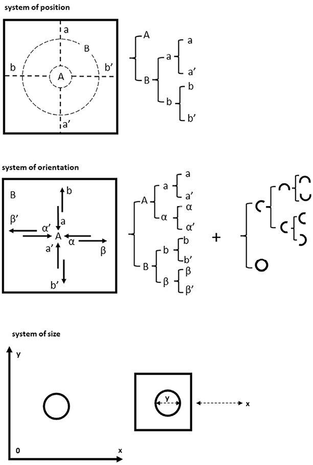
Fig. 2. The three subsystems of topological plastic organisation according to Groupe µ 1992. Diagrams by the author.
In accordance with the model of visual structure and object recognition proposed by the psychologist Stephen E. Palmer (Palmer 1975), the formemes are said to be three: position, orientation and dimension (in Palmer: location, orientation and length). In fig. 2, the subsystems of position, orientation and size/dimension are visualized, in accordance with Traité, as sets of alternatives for rendering an element on a fond or visual field. Thus, the placement of the element in the field can be central or marginal (A:B), vertical or horizontal (a:b), upper or lower (a:a’), left or right (b:b’). The orientation, perceived as direction within the field, can be inwards or outwards (A:B), horizontal (α:α’) or vertical (a:a’), upwards or downwards (b:b’), leftwards or rightwards (β:β’). These alternatives are not exhaustive, because orientation is not only direction but also openness as opposed to closedness. An open shape, for example a semicircle, can thus have an orientation tending upwards, downwards, leftwards or rightwards. The simplest system, that of size, is determined by the size of a line or shape in relation to the field, but also the distance between the field and the spectator. (Groupe µ 1992: 210-217.)
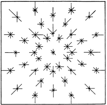
Fig. 3. Result of Goude’s and Hjortzberg’s experiment at Stockholm University in 1967. Experimental subjects were told to indicate on a scale in which of the eight cardinal directions they perceived a black disk placed at different positions in the square to be “striving”. Reproduced from Arnhem 1974: 15.
The basic contents or signifieds (signifiées) of the three formemes as plastic signifiers (signifiants) are said to be attraction, balance and dominance. The placement of an element activates perceptual forces of attraction, the orientation of elements are experienced as balanced or unbalanced, and bigger/longer elements are seen as more prominent or closer than smaller ones. The phenomenon of attraction was studied in an experiment conducted by Gunnar Goude and Inga Hjortzberg at Stockholm University in 1967 (fig. 3 and figure legend), later repeated by Palmer and Guidi (2011) with a different experimental design and other test fields than equilateral ones, but with similar results.
Because positions, orientations and sizes only acquire their semantic values in relation to a defined field or in relation to other elements in the field, Groupe µ defines such values as dependent (synnome). In addition to this sémantisme synnome plastique, there is the semiotics and rhetoric of iconoplastic relationships (sémantisme synnome icono-plastique), dependent not only on plastic values, but constituted by an interaction between plastic and iconic content and oppositions. Sometimes, Groupe µ writes, plastic semantics is not synnome, but grounded in a fully symbolic sign system, or a system of ‘extra-visual semantics’ (sémantisme extra-visuel). As with all symbolic systems, it is only articulated at the content level. The colour red as a symbol for love or the colour black for mourning are inarticulate qualities that have acquired those semantic values only because of an underlying, culturally constructed system of associations (Groupe µ 1992: 194–195, compare Sonesson 2004: 16-17).
In a diplomatic vein, Groupe µ writes that the plastic sign ‘tends to alternate between the symbol and the icon’.5 At the same time, they wonder whether the indexical dimension may provide an even more important key to the analysis of the plastic function. A brushstroke or a photographic print is an indicator (indiquant), indicating an object or act (indiqué) that existed in a certain place at a certain time. On the receiving end, spectators interpret the traces of painterly acts as carriers of the painter’s emotions or intentions (Groupe µ 1992: 195). Relationships between parts and wholes, and the differentiation of a pictorial fond from its background – or within a frame – can also be regarded as indexical (Groupe µ 1992: 378).
The ‘µ model’ of visual semiotics has received criticism from both Sonesson and the Greimas school. In a recent homage to Jean-Marie Floch, Fontanille (2023) writes that Groupe µ’s descriptions of the dynamics of the plastic sign in Traité are too unspecific, and that the content of plastic signifiers remains an important and still unresolved problem. Fontanille does not suggest any novel modes of analysis that would be different from those of Floch and Groupe µ, but the program for an ‘archaeology and anthropology of the plastic dimension’ that he outlines in his article is highly interesting. He suggests that the inscription and interpretation of visual signs within a delimited or framed field originates in the interpretation of movements of birds, clouds and animals as signs from the gods. As history and anthropology shows, it was not the physical presences in the sky or on the ground that were interpreted, but the positions and directions of their trajectories and traces (Fontanille 2023: 89-92). The words ‘temple’ and ‘template’ share the same etymology: templum, or a geometrical area laid out by Etruscan and Roman augurs for auspicial observations. An earlier controversy in classical archaeology about whether some templa were round rather than rectangular (Frothingham 1914) has been nuanced by the more recent realization that they were both: the sky and its entire horizon was the fond on which signs were read, and the position and gaze of the augur was defined by the square on the ground. Its corners and cardinal axes were set down with stone markers, as exemplified by the excavated site at Bantia (Gottarelli 2013: 29-44, see fig. 4).
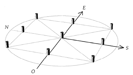
Fig. 4. Reconstructed placement of the nine stone markers of the templum at Bantia in relation to cardinal axes. Drawing reproduced from Gottarelli 2013: 32
A connection between ritual practises in Etruscan templa and a growing tendency to conceive of pictorial space as a delimited field is not at all implausible. After all, the first known instances of paintings that anticipate our modern idea of rectangular pictures are from Roman times, products of the fresco styles of Pompeii and Rome. With the advent of the Western art museum and the development of antiquarianism, old frescoes, reliefs and even floor mosaics were removed from their original contexts and anachronistically framed as ‘pictures’. The hegemony of the frame and a unified pictorial space from the Renaissance onwards also meant that certain norms and rules for the plastic organisation of scenes and ‘stories’ were developed.
Another, more daring part of Fontaille’s hypothesis is that the appreciation of plastic meaning in pictures derives from a hermeneutic tradition of interpreting arcane signs and holy texts. In Scholastic theology, we encounter the distinction between literal interpretation, tropological (or moral) interpretation, allegorical interpretation and anagogical interpretation. The fourth, anagogical level is the most difficult one. It concerns the progress of mankind and the end of times, and it requires insights that transcend familiar concepts and previously acquired knowledge (Fontanille 2023: 95). In the context of art theory, Fontanille associates the anagogical level with Erwin Panofskys third or iconological level of interpretation (Fontanille 2023: 100-103). Reconsidering Roland Barthes’ discussion of the difference between l’obvie (the obvious, or studium) and l’obtus (the hidden, or punctum), Fontanille suggests that l’obtus is the aesthetic equivalent of the anagogical level. According to Fontanille, Barthes’ account reveals that the search for meaning in aesthetic phenomena, phenomena that appear to present a signifiant sans signifié, is a modern version of the ancient wish to see beyond the surface of the familiar world (Fontanille 2023: 103-109). Fontanille’s reflections add an important anthropological and historical dimension to the study of plastic semiotics, and are comparable to earlier remarks by Göran Sonesson, who tended to regard the Traité of Groupe µ as a bit too aprioristic.
Differently from Floch, Groupe µ acknowledges the role of texture and materiality for the genesis of plastic meaning and visual rhetoric, but these aspects are not given much space in the first edition of Traité (a second is forthcoming, at the time of writing). The pages dealing with the semiotics of three-dimensional art – sculpture and architecture – are a mere torso at the end of the book. In more recent years, material aspects have instead gained prominence in the Greimas school. Earlier, the followers of Greimas did not escape criticism for being too dependent on language models. In 1996, Marie Carani published an article in which she defended her topological analyses of the ‘proximal space’ (l’espace du proche) in abstract expressionist painting, rejecting the standard tendency among art critics to stress its flatness. Carani also vehemently criticises the assumption of il n’y a de sens que nommé (there is no meaning in that which cannot be named), that she thinks has dominated semiotics for too long, and adds that ‘the school of Greimas could not avoid the pitfall […] of linguistic imperialism’ (Carani 1996: 17).
The art historian Anne Beyaert, who could be regarded as affiliated with the Greimas school, scrutinized Groupe µ’s and Fernande Saint-Martin’s accounts of material texture and proposed a clarification of the relationship between texture, colour and pictorial illusionism. When the roughness of texture increases and reveals the material reality of the picture, illusionism decreases. However, increased roughness heightens the perceived saturation of colours and lowers their degree of lightness (Beyaert 2003: 85). Another contribution by Beyaert is partly inspired by a distinction made by Fontanille, in a summary of a project on the material aspects of writing, between ‘formal support’ (support formel) and ‘material support’ (support matériel).
If, in the context of ancient writing, the material support is a monumental stone, and the formal support the verticality of inscriptions and their placement high above the people (Fontanille 2005: 186), the material and formal factors are distinct and yet inseparable. The stone gives material support to the formal support, lending it material constraints, but conversely the formal support alters the perception and the phenomenological status of the material support. The stone is no longer a rough stone which presents its naked texture to us. The texture has become a non-thematized background of a fond for the formal support of the semiotic inscription. But differently from an inscription on a fragile piece of papyrus or paper that we can hold in our hands, the monumental stone imposes its sheer material weight on us, who still after 2 000 years can very physically feel the impact of the inscribed stone as a manifestation of religious and ideological power. (Compare how Groupe µ defines the meaning of size as a combined function of size in the visual field and distance from the spectator.)
Beyaert applies such considerations to the study of object- and installation art, notably the work of Joseph Beuys. In the oeuvre of Joseph Beuys, we encounter peculiar material supports – lumps of fat, food stuffs, objects wrapped in felt, trees planted in Kassel, blocks of stone placed in Darmstadt. Beyaert asks: ‘Where is the work, or where does it end?’ (Beyaert 2008: 107). To experience this ‘work’ or these ‘works’ is to experience spatial and temporal trajectories between materially very salient supports that carry a formal support of inscriptions and thematic difference. Within the narrative universe of Beuys’ private mythology and philosophy, the material ‘thing’ (chose, Ding) presents itself as sometimes a thing of nature, sometimes an object (objet, Sache) of semiotic exchange and culture (Beyaert 2008: 103, 106-108).
These material and phenomenological dimensions are not covered by Traité, but here Beyaert leaves the confines of pictorial semiotics proper and enters a wider field of visual or spatial semiotics. Both Beyaert and another semiotician with a background in art history, Maria Giulia Dondero, stress the importance of bringing visual semiotics closer to contemporary art, and also the legacy of such earlier art historians as Henri Focillon. This is not unexpected, given the material turn of the Greimas school, and a quote from Focillon in a text by Bordron and Dondero bears a direct relationship to Fontanille’s distinction between formal and material support: ‘A form without its support is not form, and the support is form by itself’ (Bordron and Dondero 2023, italics by the authors).
4 Meyer Schapiro’s criticism of formalist art history
Despite appreciative remarks on Focillon’s aesthetics made by semioticians in the Greimas tradition, it should be noted that this art historian inspired a formalist tendency that runs contrary to most of the aims and aspirations of semiotics. He viewed art as an expression of an innate or organic life-force rather than as a culturally mediated phenomenon. The iconologists and followers of Panofsky represented a tendency in the opposite direction: an almost complete focus on iconography and textual sources at the expense of formal and compositional analysis. Both schools neglected the extent to which the matter and form of visual representation affects and influences the perceived content. With their theory of icono-plastic rhetoric, Groupe µ has defined conditions for an analysis that takes this interaction into account and bridges the gap between aesthetic and discursive approaches (Groupe µ 1992: 345-361). Reyes-Garcia and Sonesson seem to admit the relevance of a combined plastic and pictorial analysis when they write that ‘perhaps different artists will correlate the plastic and the pictorial layers in different ways, so that the correlation itself becomes significant’, and ‘even if there is a redundancy between plastic and iconic language in the case of each particular artist’s work, the double analysis would not be in vain’ (Reyes-Garcia and Sonesson 2019: 80-81).
Ninety years before Reyes-Garcia and Sonesson wrote this, and without using the word semiotics, Meyer Schapiro realized the limitations of formalism and stressed the importance of correlating formal analysis with an account of narrative, thematic and ideological factors. Jurgis Baltrušaitis, a student of Henri Focillon and married to Focillon’s daughter, was at the time a leading advocate of the formalist approach in the study of Medieval art. His book La Stylistique ornamentale dans la sculpture romane, first published in 1931, became highly influential. In his review of the book, Schapiro characterised Baltrušaitis’ approach to the formal structure of artworks as Platonic rather than Aristotelian: forms have a separate existence as universals, prior to perceptual experience.
According to Schapiro, Baltrušaitis describes Form as if it were a ‘definite separable entity’ within the work or an abstract schema applied mechanically without regard to content. An example is provided: ‘Starting from a palmettoid design, [the artist] makes a siren; the siren becomes a crucifixion; but sirens and crucifixions all bear the key palmettoid form’ (Schapiro 1977: 267). When Baltrušaitis wanted to demonstrate the isomorphy between a figurative tympanum and an ornamental palmette, he could, according to Schapiro, do so only by ‘misdrawing both the tympanum and the palmette’ (Schapiro 1977: 275). Schapiro’s comparison between his own shaded drawing of the palmette in question (Fig. 5, left) and the tympanum schema constructed by Baltrušaitis (Fig. 5, right) is indeed quite revealing. Baltrušaitis has flattened out the ornament and reversed the relationship between concave and convex elements.
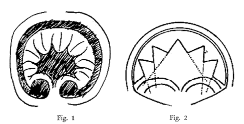
Fig. 5. Drawings from Schapiro 1977: 276.
In Schapiro’s opinion, the main flaw of Baltrušaitis’s formalist approach was its disregard for historical specificity and context: ‘To make Romanesque a modern art, or an art in modern terms, he has reduced content to a passive role, and has identified form with geometrical schematisms and with architecture – an abstract art’ (Schapiro 1977: 283). Similarly, modernist art critics at the time described abstract painting as an art form with no connection to earlier art or representational content. An influential representative of this aesthetic ideology was Alfred Barr, director of the newly founded Museum of Modern Art in New York. In an article for the first issue of the journal Marxist Quarterly, Schapiro reviewed Barr’s exhibition and book Cubism and Abstract Art (1936) and again stressed the similarity between Formalism and Platonic idealism:
in a Platonic manner [Barr] opposes to the representation of objects, as a rendering of the surface aspects of nature, the practise of abstract design as a discovery of the ‘essence’ or underlying mathematical order of things. He […] overlooks the imaginative aspect of the devices for transposing the space of experience to the space of the canvas, and the immense, historically developed, capacity to hold the world in mind. (Schapiro 2013: 17)
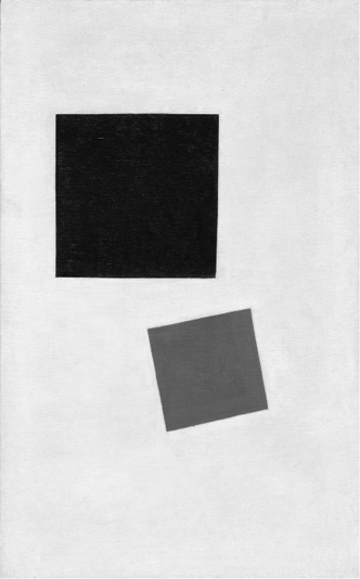
Fig. 6. Kazimir Malevich, Painterly Realism of a Boy with a Knapsack – Color Masses in the Fourth Dimension, 1915. Oil on canvas, 71.1×44.5 cm. New York, Museum of Modern Art.
Image source: Journal of Literary Education 1, 2018.
Of special interest in this quote is the formulation ‘transposing the space of experience to the space of the canvas’. It is essentially a definition avant la lettre if iconic and iconoplastic rhetoric. A painterly ‘space of […] canvas’ that is probably difficult to connect to a ‘space of concrete experience’ is Kazimir Malevich’s painting of two squares, one black and one red, acquired for the Museum of Modern Art and reproduced in Barr’s book (Fig. 6). Although the title given to the painting described it as an abstract rendering of a boy carrying a knapsack, Barr described it in exclusively abstract terms: the red square ‘holds its own’ against the larger black square, because it is more ‘active’ in its diagonal orientation.
However, Schapiro thought Barr had overlooked a possible relationship with an earlier painting by Malevich: his cubist Woman With Pails: Dynamic Arrangement (c.1912–13). In the two water pails the peasant woman is balancing, both rendered as flattened trapezoid shapes in a cubist space, Schapiro sees, similarly to the later composition with two squares, a ‘preoccupation with balance as a basic aesthetic principle governing the relation of two counterpart units’ that are ‘not human, but suspended, non-organic elements’ (Schapiro 2013: 21). He concludes that abstract painting was the result of gradual development, not a sudden break with representational art, and that it cannot be fully disassociated from previous experiences of art and visual reality in the mind of the beholder.
5 Schapiro’s visual semiotics: The cultural shaping of fields and image-signs
Among Schapiro’s texts on medieval and Romanesque art, his study of the tympanum relief and trumeau at the interior west wall of the abbey church of Sainte-Marie in Souillac, France, is probably the most striking example of how he combined a careful formal analysis with an account of how visual/plastic form adds content to a work. The relief depicts the legend of Theophilus of Adana. At its most simple, material level it consists of nine slabs of stone. They are arranged as a closed set of 3×3, but do not conform to any artificially drawn grid, as the left part of Schapiro’s own drawing for the study shows (Fig. 7). The top row of rounded slabs forms a three-foil arch, but the leftmost segment of the arch is larger than the rightmost, and remarkably skewed too. In several places the joins between the slabs cut through the figures. The legend of Theophilus describes the life of a cleric who sold his soul to the Devil but was redeemed because of his penitence. Three successive parts of the story are told within the same pictorial space – carved out on the large, horizontal, central slabs and on the lover part of the three-foil arch – in a case of simultaneous succession. In a reading sequence from right to left, we see two encounters between Theophilus and the Devil. Above, Theophilus reclines on a bed near his church, and the Mother of God descends with angels from the clouds to return the Devil’s contract to him to be burned. The central portion of the relief is flanked by two large, seated saints: to the left Benedict, to the right Peter.
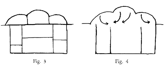
Fig. 7. Drawings from Schapiro 1977: 103.
The whole composition once belonged to the west portal of the church, destroyed during the hugenot wars in the sixteenth century. It shares its current site at the interior west wall with other fragments from the former portal, including a remarkable, intricately carved trumeau. Schapiro describes how certain asymmetries contribute to the ‘discoordinate’ character of both relief and trumeau, or as he explains it, ‘By discoordination I mean a grouping or division such that corresponding sets of elements include parts, relations, or properties which negate that correspondence’ (1977: 104). He then asks the reader to consider the downward movement of the Mother of God and the three angels (Fig. 7, right), because the left angel aims at Theophilus in the central field with the pointed direction of its wing, and does not correspond with the verticality of St Benedict in the field below. From the central arch, the second angel and the Mother of God descend in a countermovement. The angel to the right, however, breaks the symmetry and moves straight down to St Peter in the right flanking field. Schapiro notes that this ‘procedure of discoordinate pairing, of repetitions of counterpart elements, of oppositions in repeated units’ continues below the main relief, in the pairing of two subordinate reliefs depicting Joseph and Isaiah, and in the entrelac of human and nonhuman bodies that adorn the trumeau at the right.
The striking contrast between the rigidity and order of Romanesque architecture and the disorder of its carved decorations had presented a problem for art historians. In Souillac, the joints between uneven stone slabs seem haphazard and the most prominent figures in the iconographic scheme, far from being centrally, symmetrically placed, are in marginal, unsymmetrical positions. Schapiro interprets this plastic ‘mobility’ as a different kind of visual order that expressed the transience and social instability of eleventh- and twelfth-century France.
The decentralizing episodic forms and discoordinate schemes, the antithetic mobility of the figures, the concreteness and energy of presentation, in contrast to the traditional centralized, symbolic designs, presuppose the broader conception of the active, morally divided individual, at once Christian and secular, whose struggles are resolved in the religious legends of the church. (Schapiro 1977: 122).
For being one of the most influential art historians in his generation, or indeed of the whole twentieth century, Schapiro’s scholarly production is remarkably sparse. He obviously adhered to a principle of keeping his written accounts to a minimum, thus allowing the studied artifacts to speak for themselves. In his few writings explicitly related to semiotics, there is not one single reference that makes it possible to connect him to any school of what was still a young discipline. However, he did attend lectures by John Dewey at Columbia University (O’Donnel 2016: 93–95), and his own lecture notes show that in the 1960s his teaching was coloured by American pragmatism and Peircean semiotics (O’Donnel 2016: 99–100; Smith 2012: 43–45). In 1952, at a symposium that resulted in the edited volume which included Schapiro’s important essay ‘Style’, he debated the analysis of images with one of the fathers of the structuralist movement: Claude Lévi-Strauss.
Schapiro had doubted Lévi-Strauss’s claim that it would be possible to formalise visual language like mathematical information theory, and he did two simple drawings on the spot to show why. The drawings show the same rectangle, divided into a larger and a smaller field. The only difference is the orientation of the rectangles: one is oriented with the larger part at the top, the other with the larger part turned down. In the first case, the larger part seems to ‘weigh down’ the smaller one, while in the latter it ‘carries’ it. These are opposed aesthetic responses to plastic structures that are topologically and thus mathematically identical, but not psychologically exchangeable.
Almost twenty years after the symposium, the diagrams were published in Schapiro’s article on ‘Field and Vehicle in Image-Signs’, written for the newly founded journal Semiotica, later reprinted in the Dutch journal Simiolus (Schapiro 1973a). By ‘image-sign’ Schapiro means the representational function of images; ‘vehicle’ is the signifier of image-signs. To his mind, elements with a merely aesthetic function in the image are ‘non-mimetic elements’, and he believes they ‘owe their development and variety in great part to their service in representation’ (Schapiro 1973a: 18). To some extent, he regards image-signs to be culturally constructed or arbitrary: when the Impressionists ‘undertook to represent the visual world more truly by juxtaposing patches of colour without defining outlines’, the result was not necessarily truer than ‘the archaic black outline’ (Schapiro 1973a: 18).
However, Schapiro’s principal focus in this short article is not the mimetic or iconic function of the image-sign – which he tends to take for granted – but the basic elements that constitute its delimitation and its spatial coordinates. He reminds his readers that the rectangular picture field, seen as natural in contemporary image production, is an obvious cultural construct that was not established until late in the history of humankind. In pictorial art which did not conform to the modern norm that pictures depict a single space at a single moment in time, the function of the frame can be highly ambiguous. Sometimes it is relegated to the status of a background element when figures are depicted crossing the frame – as is often seen in Romanesque reliefs. Schapiro also describes the opposite, ‘the frame that bends and turns inward into the field of the picture to compress or entangle the figures’ (1973a: 11–12). He provides both three-dimensional and two-dimensional examples of this: the trumeau in Souillac and a page from the Echternach Gospels (Fig. 8).
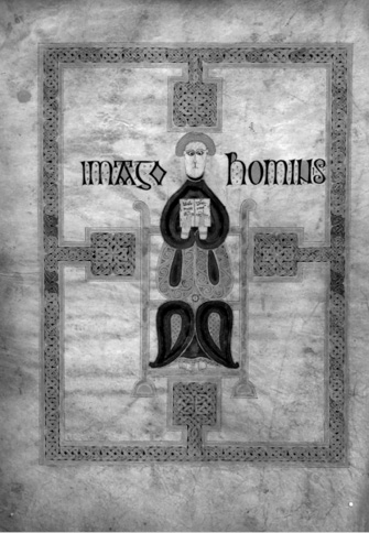
Fig. 8. Illuminated page with the symbol of St Matthew (‘Imago hominis’) from the Echternach Gospels, c. AD 690. Paris: Bibliothèque Nationale, ms. lat. 9389. Image source: Web Gallery of Art. <www.wga.hu/frames-e.html?/html/zgothic/miniatur/0651-700/1irish/3echter3.html>
In systematic fashion, Schapiro defines and exemplifies the material factors that constitute the image-sign as an enclosed whole: its format (outer shape and height–width ratio); its prepared surface (flat or sculpted); the boundaries between its parts; the size, placement, and direction of its parts (Schapiro 1973a: 12–16). In Christian iconography, the decisiveness of placement for meaning is at its most evident when two figures are seen flanking a central, more prominent figure, such as Peter and Paul on Christ’s left and right (see Uspensky 1976). Right and left have different axiological values – ‘left’ being traditionally the less valued side – but heraldic reversion turns the subjective ‘left’ of ‘us’ as spectators into the ‘right’ of the people facing us from within the space of the picture. When there is no central figure as a reference point, Schapiro writes, the values of right and left will nevertheless be determined from the spectator’s perspective: ‘In both cases the parts of the field are potential signs; but the field is open to reversal in submitting to an order of values’ (Schapiro 1974a: 14).
The realisation that placements, directions, and sizes in pictorial space are ‘potential signs’ is reminiscent of Jean-Marie Floch’s homologation of sensory qualities, associated with the left and the right halves of Kandinsky’s Composition IV, with the binary opposition of ‘combat’ vs ‘joy of life’. Later, it was also picked up on by Gunther Kress and Theo van Leeuwen in their ‘grammar of visual design’. Defining the composition of pictures as a ‘metafunction’ and equivalent to the ‘textual metafunction’ of sociolinguistics, Kress and van Leeuwen analyse right–left and top–down polarisations in terms of given–new and ideal–real (Kress and van Leeuwen 2006: 179–185, 186–193). However, their work on sociosemiotics has very few references to art historians and none to Floch or Schapiro.
In his essay Words and Pictures (Schapiro 1973b), written for the series Approaches to Semiotics, Schapiro summarises a thousand years of visual interpretations of the same Biblical episode from Exodus 17 in which Moses, supported by Aaron and Hur and empowered by God, commands the battle against the Amalekites. In late Roman and early Romanesque versions, Moses occupied the centre of the composition facing the spectator, in a manner akin to how emperors and kings were depicted. But in some French book illuminations from the thirteenth century, Schapiro notices a shift: three-quarter views and profiles replaced frontal views, and the three leading actors were increasingly depicted as equal in size and placement to the soldiers. He terms the frontal view ‘theme of state’ and the profile view ‘theme of action’.
This semiotic difference is also stressed by Kress and van Leeuwen, but they interpret it differently. In their account, the frontal face always (in all pictures or in all visual culture) signals an active and ‘engaged’ attitude and the profile or three-quarter view a ‘detached’ one (Kress and van Leeuwen 2006: 133–140). They define this binary opposition between engaged and detached attitude as a dimension of the ‘interactive metafunction’ – the relationship between the picture and the spectator. It does not concern relationships between actors within the picture, which they consider to be dependent on abstract directional ‘vectors’. Schapiro, however, interprets the profile views and ‘theme of action’ more contextually as characteristic of a specific change of mentality – ‘the heightened interest in action, whether in religious or secular scenes’, visible as ‘an objective engagement in which the actors move in a common space of their own and are attentive to another without confronting the viewer of the image as in the theme of state’ (Schapiro 1973b: 29). Malgré the influential and sometimes quite anachronistic generalizations of Kress and van Leeuwen, Schapiro’s historically grounded approach must be regarded as more appropriate for a semiotics that aspires to be social.
6 Schapiro, Floch and non-figurative painting
Semioticians are given to recycling certain favourite examples, hence Kress and van Leeuwen’s references to the same painting by Kazimir Malevich as in Alfred Barr’s book from 1936 and in Schapiro’s review of it from 1937 (Fig. 6). More surprising than this possible indication of unrecognised influence, their description of the work is more reminiscent of formalist Barr than Schapiro. Speaking of perceptual directions or ‘vectors’ that supposedly determine the structure of ‘narrative’ pictures, they write:
because the red square is tilted, the painting is more similar to El Lissitzky’s Beat the Whites With the Red Wedge than, for instance, to Mondrian’s compositions of red, yellow and blue squares: it is about ‘dynamic action’ whereas Mondrian’s compositions are about stable order, a search for equilibrium – the red square seems to move away from the oppressively large black square. (Kress and van Leeuwen 2006: 59)
The cognitive contents that Kress and van Leeuwen mention – vectors, dynamic action, equilibrium, ‘move away’, ‘oppressively’ – could all be regarded as the result of a mental process that turns relational visual properties into plastic signifiers. But it is strange that these socially inclined semioticians consider the recognition of narrative structures in pictures to be dependent not on social context and figurative content, but on a singular sensory quality: ‘vectorality’. They have certainly overinterpreted the extent to which plastic elements determine and shape narrative interpretations.
In contrasting Malevich’s ‘dynamic’ quality to Mondrian’s ‘stable order’, Kress and van Leeuwen also overlook the importance of borders and frames. Mondrian’s paintings are composed, not of ‘squares’, but of horizontal and vertical lines that cross one another and are cut off by the enclosing border. As Schapiro says, a painting by Mondrian, although non-figurative, is still experienced as ‘corresponding in its entirety to a segment of space excepted from a larger whole’, its plastic structure being evocative of a worldview: ‘a model of one aspect of contemporary thought: the conception of the world as law-bound in the relation of simple, elementary components, yet open, unbounded and contingent as a whole’ (Schapiro 1973a: 19). That amounts to saying that these paintings are not ‘abstract’ in the popularized sense of being only decorative, flat surfaces with no connection to lived experience and emotion. Floch ends his analysis of Kandinsky’s painting in a similar vein, writing that ‘ce tableau doit être considéré comme non figurative et non comme abstrait’ (the painting is non-figurative but not abstract, Floch 1981: 155), because he denies have committed the error for which both Groupe µ and Sonesson held him accountable, that of defining a plastic language that is merely a redundancy of figurative representation.
Floch will in no way admit that the example set by Kandinsky for modern art is equivalent to an anaemic ‘abstraction’ from reality. Rather, he subscribes grosso modo to Kandinsky’s lifelong project of cultivating a refined aesthetic sensibility that will, probably, pave the way for a new way of life – vita nova (Floch 1981: 152). By attending closely to Kandinsky’s own statements and intentions, stressing the genesis in Kandinsky’s art of motives and themes that surface in Composition IV, Floch also manages to demonstrate the semiotic implications of the idea that sensory qualities can carry the same fullness of meaning as earlier, figurative representations. The principal implication for visual semiotics is that a spatial system, defined and culturally determined by the delimitation of the Templum/template or the pictorial frame (figs. 2, 3, 4), had at the time of Modernist painting acquired enough associative value or ‘semantic load’ to carry meaning by itself, irrespective of whether the elements organised within the constraints of the system resemble familiar objects or not.
However, one may agree with Reyes and Sonesson in their criticism of certain weaknesses of Floch’s approach. The principle of binary segmentation of surfaces and homologation of visual and semantic values yield interesting results in the Kandinsky case and in Floch’s many analyses of photographs and publicity pictures, but what about structures that do not lend themselves as easily to binary division? Kress and van Leeuwen’s characterization of Malevich’s and Mondrian’s art is an example that complex relationships are too easily reduced to simple binary oppositions. By describing Malevich’s painting as the ‘dynamic’ opposite of Mondrain’s ‘stable order’, they manage to capture only the most superficial stylistic differences between two famous oeuvres, but nothing of the plastic content that, at least according to Fontanille, we should be prepared to specify more distinctly.
The plastic content discerned by Schapiro in Malevich’s painting is ‘balance’, a balance that he describes as firmly grounded in bodily and physical experience, even if expressed as the balance between two squares. In the case of Mondrian, Schapiro perceives an equilibrium of spatial relationships that at the same time implies a continuation outside the frame; in this case, the plastic content could be described as an indexical relation between the perceived phenomenon as a part of a conceived whole (or even a whole worldview). Schapiro makes these brief observations intuitively, without recourse to the procedures practised by Floch and recommended by Fontanille.
7 Conclusion: The multiple facets of plastic semiotics
If Schapiro could be awaked from the dead and asked about his opinion of the various schools of visual semiotics, he would probably prefer the positions of Groupe µ and Sonesson, partly influenced as they are by Peirce and cognitive psychology. As an example of ‘balance’, Malevich’s two squares present a secondary iconicity by means of ‘exemplification’, but visual balance also has a synaesthetic or proprioceptive dimension. If these factors are decisive for the sign in question, it is clearly an iconic sign and not a symbolic or semi-symbolic one. Groupe µ stresses that plastic meaning is also dependent on indexical relationships between part and whole, or between a physical activity and the resulting traces, and the topological studies of gestural painting by Saint-Martin, Carani and other members of the Quebec school can be quoted in support of this thesis. At the same time, the methodological value of binary segmentation and homologation should not be ruled out, especially not in icono-plastic analysis and in the context of the publicity picture. It really seems that there is more to sensory qualities and plastic language than can be confined within a single ‘school’ or mode of semiotic analysis.
Acknowledgements
This paper is a revised and expanded version of the presentation given by the author at the XII conference of the Nordic Association of Semiotic Studies (NASS) in Vilnius, Lithuania, 5–7 November 2021. Research and participation in the conference was funded by Åbo Akademi University as part of the author’s tenure as lecturer in Visual Studies.
Notes
1 If not otherwise indicated, all translations in this paper of quotes from texts originally in French and German are by the present author.
2 This interdependence between part and whole is referred to by Sonesson as ’resemantisation’ and by Palmer as ’The parsing paradox’. Palmer 1975: 295-297.
3 I have here chosen to translate répertoire as “repository”, because it better describes the storage function implied in the French text.
4 In original: Das Wort ist ein innerer Klang.
5 In original: [the plastic sign] tend tantôt vers le symbole, tantôt vers l’icône.
References
Arnheim, R. 1974. Art and Visual Perception: A Psychology of the Creative Eye. Second revised edition. Berkeley: University of California Press.
Bertetti, P. 2017. Signs and figures: Some remarks about Greimas’ theory of the figurative. Sign System Studies 45 (1-2), pp. 88-103.
Beyaert, A. 2003. Texture, couleur, lumière et autres arrangements de la perception. Protée 31 (3), pp. 81–90.
Beyaert, A. 2008. De la texture à la matière. Protée 36 (2), pp. 101–110.
Bordron, J.-F. and Dondero, M. G. 2023. L’expression: de Hjelmslev à l’analyse computationelle des larges collections d’images. Actes Sémiotiques #129. Available at <https://doi.org/10.25965/as.8077> [Accessed 5 Jan 2024].
Bryson, N. 1981. Word and Image: French Painting of the Ancien Régime. Cambridge: CUP.
Carani, M. 1996. La sémiotique visuelle, le plastique et l’espace du proche. Protée 24 (1), pp. 16–24.
Dondero, M. G. 2020. The Language of Images: The Forms and the Forces. Cham: Springer Nature.
Floch, J.-M. 1981. Kandinsky : Sémiotique d’un discours plastique non figuratif. Communications 34, pp. 135–158.
Fontanille, J. 2005. Conclusions: du support matériel au support formel. Les écritures entre support et surface. Ed. Isabelle Klock-Fontanille and Marc Arabyan. Paris: L’Harmattan, pp. 183-200.
Fontanille, J. 2023. Archéologie et anthropologie de la dimension plastique des sémiotiques visuelles. En hommage à Jean-Marie Floch. Estudos semióticos 19 (2). Available at <https://doi.org/10.11606/issn.1980-4016.esse2023.207670> [Accessed 5 Jan 2024].
Frothingham, A.-L. 1914. Circular Templum and mundus. Was the Templum Only Rectangular? American Journal of Archaeology 18 (3), pp. 302-320.
Gottarelli, A. 2013. Contemplatio: Templum solare e culti di Fondazione. Sulla regola aritmogeometrica del rito di Fondazione della cittá etrusco-italica tra VI e IV secolo a.C. (Vol I, 1998–2023). Bolgona: Te.m.p.l.a., University of Bologna.
Greimas, A. J. 1989. Figurative Semiotics and the Semiotics of the Plastic Arts. New Literary History 20 (3), pp. 627–649.
Groupe µ (J. Dubois, P. Dubois, F. Edeline, J.-M. Klinkenberg, P. Minguet) 1979. Iconique et plastique : Sur un fondement de la sémiotique visuelle. Revue d’Esthétique 32 (1–2), pp. 173–192.
Groupe µ (F. Edeline, J.-M. Klinkenberg, P. Minguet) 1992. Traité du signe visuel: Pour une rhétorique de l’image. Paris: Seuil.
Kandinsky, W. 1912. Über das Geistige in der Kunst. München: R. Piper & Co.
Kress, G. and van Leeuwen, T. 2006. Reading Images: The Grammar of Visual Design. 2nd rev. edn, London: Routledge.
O’Donnel, C. O. 2016. Pragmatist Historians of Art. PhD thesis, University of California, Berkeley. Available at: <https://escholarship.org/uc/item/5n29d835> [Accessed 18 Sept 2023].
Palmer, S. E. 1975. Visual Perception and World Knowledge: Notes on a Model of Sensory-Cognitive Interaction. Explorations in Cognition. Ed. D. A. Norman and D. E. Rumelhart. San Francisco: Freeman, pp. 279-307.
Palmer, S. E. and Guidi, S. 2011. Mapping the perceptual structure of rectangles through goodness-of-fit ratings. Perception 40, pp. 1428-1446.
Persinger, C. L. 2007. The Politics of Style: Meyer Schapiro and the Crisis of Meaning in Art History. PhD thesis, University of Pittsburgh. Available at: <https://d-scholarship.pitt.edu/10313> [Accessed 18 Sept 2023]
Reyes-Garcia, E. and Sonesson, G. 2019. New approaches to plastic language: Prolegomena to a computer-aided approach to pictorial semiotics. Semiotica 230, pp. 71-96.
Ringbom, S. 2022 (1970). The Sounding Cosmos: A Study in the Spiritualism of Kandinsky and the Genesis of Abstract Painting. Stockholm: Stolpe.
Saussure, F. (1972). Cours de linguistique générale. Paris: Payot & Rivages. First pub. 1916.
Schapiro, M. 1973a. On some problems in the Semiotics of Visual Art. Field and Vehicle in Image-Signs. Simiolus 6 (1, 1972–1973), pp. 9–19. Available at: <https://www.jstor.org/stable/3780400> [Accessed 17 Sept 2023].
Schapiro, M. 1973b. Words and Pictures: On the Literal and the Symbolic in the Illustration of a Text. Ed. by Thomas A. Sebeok. Approaches to Semiotics 11. The Hague: Mouton. First pub. 1969.
Schapiro, M. 1977. Romanesque Art. London: Chatto & Windus.
Schapiro, M. 1998. Style. The Art of Art History: A Critical Anthology. Ed. by Donald Preziosi. Oxford: OUP, pp. 143–149. First pub. 1953.
Schapiro, M. 2013. The Nature of Abstract Art. On curating # 20, pp. 13–24. Available at: <https://www.on-curating.org/issue–20-reader/nature-of-abstract-art.html> [Accessed 17 Sept 2023]. First pub. 1937.
Smith, T. 2012. Meyer Schapiro on style in art and science: Notes from a Theory and Methods in Art History graduate seminar lecture course, Columbia University, New York, 1973. Journal of Art Historiography 7. Available at <https://arthistoriography.files.wordpress.com/2012/12/smith.pdf> [Accessed 17 Sept 2023].
Sonesson, G. 2004. Retour sur la matière du sens à l’ére de la production digitale. Visio 9 (1-2), pp. 215-234.
Uspensky, B. A. 1976. La ‘droite’ et la ‘gauche’ dans l’art des icônes. Travaux sur les systèmes de signes. Ed. by Yuri M. Lotman & Boris A. Uspensky. Brussels: Éditions Complexe, pp. 168–174.
Vygotsky, L. S. 1971. The Psychology of Art. Cambridge, MA: MIT Press.