Politologija ISSN 1392-1681 eISSN 2424-6034
2023/2, vol. 110, pp. 75–103 DOI: https://doi.org/10.15388/Polit.2023.110.3
The Welfare State Scattergram
Joni Askola
PhD Candidate, Charles University, Faculty of Social Sciences
https://orcid.org/0000-0002-0084-5156
Email: 87680683@fsv.cuni.cz
Benjamin Davison
MiM student, HEC Paris, Grande École
Email: benjamin.davison-pegon@hec.edu
Abstract. Welfare states have traditionally been studied through quantitative tools such as indices and qualitative ones such as typologies. However, there seems to be a lack of analytical tools that simultaneously show welfare state outcomes and development potential. In this paper, we developed the Welfare State Scattergram. This result of two indices gives the welfare state’s outcomes and fiscal capacity, the latter serving as a proxy for improvement potential. The indicator used for the X-axis is a modified debt-sustainability formula to indicate fiscal capacity and, thus, the development potential of the welfare state. The indicator used for the Y-axis gives the welfare state outcomes and consists of a weighted welfare state outcomes indicator.
Keywords: welfare state, welfare state outcomes, fiscal capacity, scattergram, index creation.
Gerovės valstybės sklaidos diagrama
Santrauka. Gerovės valstybės paprastai nagrinėjamos pasitelkiant kiekybinius įrankius, pavyzdžiui, agreguotuosius indeksus, ir kokybinius metodus, kuriant tipologijas. Tačiau, panašu, vis dar trūksta analitinių priemonių, kurios tuo pat metu užčiuoptų gerovės valstybės padarinius ir plėtros perspektyvas. Šiame straipsnyje pristatome gerovės valstybių sklaidos diagramą. Šis dviejų agreguotų indeksų susiejimas rodo gerovės valstybės padarinius ir fiskalines galimybes, o pastarasis indeksas taip pat leidžia užčiuopti plėtros perspektyvas. X ašies indiktatorius yra modifikuota skolos tvarumo formulė, leidžianti užčiuopti fiskalines galimybes, taigi ir gerovės valstybės vystymosi potencialą. Y ašies indikatorius leidžia įvertinti gerovės valstybės padarinius.
Reikšminiai žodžiai: gerovės valstybė, gerovės valstybės padariniai, fiskalinės galimybės, sklaidos diagrama, indekso kūrimas.
________
Received: 21/11/2022. Accepted: 16/04/2023
Copyright © 2023 Joni Askola, Benjamin Davison. Published by Vilnius University Press. This is an Open Access article distributed under the terms of the Creative Commons Attribution License, which permits unrestricted use, distribution, and reproduction in any medium, provided the original author and source are credited.
Introduction
A welfare state is a concept of government in which the state or a well-established network of social institutions plays a key role in the protection and promotion of the economic and social well-being of citizens.1 The concept of welfare state takes on different meanings in different countries. Although the idea refers to welfare currently provided by the state, it can also be used to denote an ideal model of provision. In this ideal, welfare is provided comprehensively for every citizen. In practice, there are several models of welfare state.2 Welfare state research is a crucial part of social policy, and welfare states face numerous challenges: income inequality in OECD countries is at its highest level for the past half-century. The average income of the wealthiest 10% of the population is about nine times that of the poorest 10% across the OECD, up from seven times 25 years ago.3 The COVID-19 crisis’ impact is another factor widening the gap between the rich and the poor. It also increased the debt-to-GDP ratios of most welfare states worldwide, if not all of them. The European Union’s average debt-to-GDP ratio increased from 78.8% in 2019 to 91.8% in 2020,4 while the European Union’s official recommended maximum debt threshold lies at 60% of GDP. More than ever, social well-being is being perceived through the lens of economic constraint, with several European countries scaling back their welfare systems due to budgetary concerns.
Evidence and data are key to policy-making, in particular when it comes to setting priorities, mitigating negative impacts, and finding the best possible trade-offs.5 The evidence and data must also be adequately used to develop a clear analysis. Whether through quantitative tools with indices or qualitative methods using typologies, welfare state outcomes and development potential are complex to analyse. Quantitative indicators can be used to measure the outcomes of welfare states in different fields. Several single indices are used to look at specific welfare state outcomes. GDP per capita and Labour Force Participation Rate are a few examples of indicators generally employed for that. Several composite indices are used as well. They are mathematical combinations (or aggregations) of a set of indicators.6 There is a continuous debate on weightings in various fields of academia, including social sciences. Composite indices gather data from different sources to visualise the multiple dimensions of a specific concept more clearly. They often propose a ranking of countries. Such indices help to capture a comprehensive overview of a given situation and grasp its constitutive elements more easily. They provide comparisons between countries or regions on a standard basis and, when they are updated on a regular basis, give a good overview of the evolution of a situation over time. This can help with designing policies to prevent or mitigate risks and encourage positive development. Indices can also, up to a certain point, help monitor the impact of policies and support forecasting exercises.7 The Human Development Index (HDI) is one famous example of those. It gives a limited vision of welfare state outcomes, despite including many indicators. It mainly reflects long-term changes such as life expectancy and does not count issues such as fiscal capacity. It does not include some contemporary issues, such as the environment or a country’s fiscal capacity. A welfare state’s fiscal capacity plays a significant role in the potential development of its governmental programs to fight issues such as inequalities or poverty, and it would thus be helpful to include it as a tool to analyse welfare states. It can also give an understanding of the cost a welfare state has paid to reach current welfare state outcomes and, thus, its financial sustainability. Other famous composite indices exist. For example, The OECD published a useful and interesting tool called the OECD Better Life Index.8 It is an online index creator based on eleven topics of well-being, and people can pick weightings to create their own indices on it. People can thus choose the weighting according to their priorities. However, fiscal capacity is again not included in the eleven topics. Other institutions are active in index creation and research. The European Parliamentary Research Committee published a list of ten composite indices to assist policy-makers. There are too many indices to do a systemic analysis of all existing ones. Many of those indices are extremely useful and methodologically sound. However, none include fiscal capacity, and those assessing welfare state outcomes are often limited to specific topics, not the total outcome.
It would be helpful to have a tool combining the analysis of welfare state outcomes and development potential. This tool should be contemporary by including issues such as the environment in the welfare state outcomes and by showing fiscal capacity, which is a present-day issue for all welfare states. As will be seen later on in this paper, there is somewhat of a dilemma for welfare states between good welfare state outcomes and room for further development. In this paper, therefore, a new tool that addresses some of the previously described flaws of existing welfare state analysis tools is created and presented. Welfare state outcomes and development potential cannot be added to a single index because the results would be very difficult to read. Thus, we decided to create a scattergram based on two indices: one that measures welfare state outcomes and another one that measures welfare state fiscal capacity, which serves as a proxy for development potential. This scattergram makes it possible to do a comparative analysis between countries. In the scattergram, fiscal capacity is used as a proxy to assess the potential for further improvements of welfare state outcomes because further development usually comes through social spending. Increasing social spending is not the only way of ameliorating welfare state outcomes. However, Haile and Niño-Zarazúa find substantial evidence to support that government social spending has significantly improved aggregate welfare in the developing world.9 Many studies have also shown that government expenditures, especially in the health and education sectors, positively contribute to public goals, including increased productivity and economic growth.10 We acknowledge numerous potential explanations for a country not having lots of fiscal capacity and thus a low development potential on the index. For example, a country might have an ongoing economic crisis or a geopolitical situation forcing it to spend much on its military. One of the limitations of the scattergram is that it looks at current outcomes and fiscal capacity. Furthermore, a country can increase its welfare outcomes without spending more than before. It is possible to reform existing social programs to target people in need more effectively than before, save on other programs that do not work well, and so on. However, spending is usually needed to develop a welfare state and increase its welfare state outcomes. Fiscal capacity is thus an acceptable proxy used to assess whether a country can spend more to reach better welfare state outcomes.
The main purpose of this paper is methodological. This research attempts to create a new tool that can make the analysis of current welfare state outcomes and further development potential easier. Its goal is not to replace existing quantitative tools but to complement them and to analyse something that these tools do not, which is the combination of outcomes and development potential of welfare states. The welfare state outcomes and potential will be measured through two indices, which will give the scattergram. This new scattergram can also be used or analysed with welfare state typologies. Clusters based on typologies are visible on it. One of the main innovations of this paper is the use of this combination of indices leading to the scattergram, providing a cartographic depiction of welfare states relative to one another based on solid and universal parameters. We can compare an approximation of state fiscal capacity through the fiscal capacity index. This first index consists of a formula taking into account necessary macroeconomic variables (interest rates, growth, inflation, debt levels), all the while taking out of account others (linked with exchange rate dynamics, proportionality, and purchasing power). Of course, multiple tweaks could be performed on this index. The same applies to the welfare state outcomes formula, composed of several weighted variables measuring outcomes in various fields related to welfare state aims. One of the other leading innovations of this paper is thus a methodological one. While creating the welfare state outcomes index, we used a modified Sleipnir matrix method to determine the relative importance and impact of different indicators according to an analytical framework. We could not use an equal weighting of all the indicators we wished to integrate to answer the greatest variety of policy goals. An equal weighting would not have provided an adequate picture of welfare state outcomes or reflected how broad each indicator was (the labour force participation rate is correlated with far more policy goals than CO2/unit of GDP). The successive sensitivity check using linear matrices could also establish no significant variance in relative importance. This combination of indices does not aim to reduce the concept of welfare state to fiscal capacity and welfare state outcomes. Still, it provides a valuable first look into how well welfare states reach given goals and how much room they have for further development, all the while relying on simple, comparable, and universal parameters. The critical contribution of this paper is the creation and explanation of the Welfare State Scattergram. These two indices give an easily readable and precise scattergram that allows us to see current welfare state’s outcomes and fiscal capacity, giving its potential for further development. It is up to the person using the scattergram to determine the type of analysis they want to do with the results based on the theories and ideologies they want to employ. The combination of welfare state outcomes and fiscal capacity visible simultaneously is a novelty that this scattergram brings to social policy as an academic field. The results of this combination can also be seen as somewhat of a dilemma for certain welfare states, as will be seen later on in the results part. Welfare states with lots of development potential often lag on welfare state outcomes, and countries doing well on outcomes tend not to have much room for further development.
This paper is organised in the following way: first, we will describe the two indices. The whole thought process behind the creation of the indices will be explained step-by-step in this part. The following section will focus on the scattergram and its results. These results will also be analysed in this part. That will enable us to move to the discussion part, in which we will analyse the upsides and limitations of this new model. To conclude, we will evaluate whether the model is suitable for further use.
1. Model
1.1. Fiscal capacity formula (X-Axis)
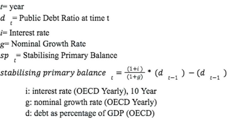
Most comparative and convergence studies of social protection use social expenditures as a measure of the level of social protection in different countries. Developed welfare states often have high social expenditures. When planning welfare policy reforms, it is important to look at a country’s fiscal capacity. One definition of fiscal capacity, in economics, is the ability of government, groups, institutions, etc. to generate revenue. The fiscal capacity of governments depends on a variety of factors including those that contribute to the tax base; the government’s ability to efficiently tax; compensating behaviour among taxed individuals, markets, and asset prices; and access to other non-tax forms of revenue.11 In general, fiscal capacity is an indication of the level of development of a country’s fiscal system; in other words, a more general indicator of state capacity. <...> Developing countries systematically seem to have lower fiscal capacity and smaller government size relative to developed countries and emerging economies. A weaker fiscal capacity diminishes state capacity in its multifarious functions, including social welfare spending.12 Results suggest that the most robust explanatory variable for social spending variables is fiscal capacity measured as total tax revenues as share of GDP. Results suggest that a 1% increase in fiscal capacity (as a percentage share of GDP) increases social protection spending (% GDP) by 0.387 percentage points and increases education expenditure (% GDP) by 0.192 percentage points, respectively.13
Public debt plays a key role in a country’s fiscal capacity. There are debt thresholds, which are levels at which debt might slow economic growth, and there are theoretical and empirical reasons why they might vary by country income.14 These thresholds differ substantially for developing and developed economies. According to a World Bank study by Mehmet Caner et al., the estimations for the subsample of developing countries yields a debt to GDP threshold of 64 percent.15 The impact of the public debt to GDP ratio exceeding the threshold level is costly in terms of GDP growth. The most extreme example is Nicaragua, where the average annual real growth rate could have been 4.7 percent higher had debt been at the 64 percent debt threshold for developing countries. High indebtedness was responsible for an annual loss of 4.7 percentage points of real GDP growth, equivalent to a 264 percentage point loss over the 28 years of the study. This example illustrates the high costs of persistent violations of debt threshold levels.16 Public debt might also have an effect on the results obtained through expansionary fiscal policy. In 1997, Alan Sutherland claimed that the power of fiscal policy to affect consumption can vary depending on the level of public debt. At moderate levels of debt fiscal policy has the traditional Keynesian effects. Current generations of consumers discount future taxes because they may not be alive at the time of the next debt stabilisation programme (or equivalently there will be a larger population of consumers available to pay taxes when a stabilisation programme is implemented). But when debt reaches extreme values current generations of consumers know that there is a high probability that they will be alive when the next stabilisation programme is implemented. A fiscal deficit can have a contractionary effect on consumer spending in these situations.17 There is no consensus on this question. However, it is clear that the level of public debt plays a role on interest rates, for example, and thus also on the Keynesian effects of spending, as with higher interest rates a larger share goes into paying them.
Fiscal capacity can be used as one way to measure welfare states’ potential for improving their outcomes through extra spending. This paper looks at the welfare state outcomes and potential for further development. The potential is measured through fiscal capacity, and it is thus vital to understand what fiscal capacity is. The formula that we created as a proxy measurement of fiscal capacity will be explained next. That formula will be used on the X-axis of the scattergram, while the formula for welfare state outcomes will be used on the Y-axis. One of the aims of this paper is to find a quick and internationally comparable way to assess a state’s fiscal capacity, and we identified several limitations and requirements to the X axis of the scattergram. Several shortcomings have also been identified. However, they do not interfere with the general sense of the results we have found.
1. Firstly, to quantitatively assess and compare the fiscal capacity of any given state, any such formula would have to take into account inflation and differences in inflation.
2. Similarly, it would also need to take into account real growth and the gap between it and nominal growth. Should these last two factors not be taken into account, the final score might place countries like the USA and Australia as significantly behind Italy or Poland in terms of fiscal capacity, solely as a result of the different inflationary profiles of these countries.
3. Another factor we needed to take into account which is linked is the future exchange rate and arbitrage between different countries’ sovereign bonds. It is important to note that this arbitrage is the result of factors such as inflation and growth.
4. Fourthly, to truly understand how capable a state is of raising funds from the markets, we need to look at the marginal cost of debt or more generally the average cost of debt.
5. Fifthly, we need to also take into account the current public debt/GDP ratio, and make it comparable between countries with all different macroeconomic variables.
6. Lastly, this indicator would also need to take into account a state’s capacity to receive additional income through taxes, which depends largely on unquantifiable political and social factors unique to each country.
The starting point for the analysis, therefore, suggested using the Debt Sustainability Formula as expressed below to evaluate fiscal capacity. Although this particular figure does not interest us directly, it does provide a quantitative indication of fiscal capacity taking into account inflation and differences in nominal growth (1, 2), the exchange rate arbitrage since the results are expressed proportionally, in percentages in national currency (3). This formula also takes into account interest rate on debt (4) as well as the current debt level (5) to understand the exact deficit or surplus a government can have to keep debt stable at the current level. Finally, the Debt Sustainability Formula takes into account indirectly for the political and social factors related to tax collection ability indirectly through the inclusion in the formula of the interest rate charged by the market on a state (6). This interest rate depends on both macroeconomic conditions and on the social and political factors related to tax collection. In effect, it is the spread between the interest rate and nominal growth which impacts our measure of fiscal capacity. However, there is a problem with the 5th point in that this formula is entirely relative to the current debt level and considers it “optimal”, this is a problem we addressed in the later iterations of X. The bigger the debt-stabilising primary balance, the more there is room for extra social spending for the government. X will thus allow us to analyse if there is room for more efforts to welfare state outcomes, of which the outcomes will be given in Y.
Formula for X
The first iteration of the fiscal capacity of a state used a simple debt sustainability formula as such:

We decided on a snapshot of 2019 as we did not want to take into account the effects of recent crises or the COVID-19 crisis. However, it had two main problems: firstly, a single-year picture was an inadequate representation of macroeconomic trends, and secondly, it did not reflect that the stabilising primary balance alone could mean very little if a country had an extremely low debt level.
The second iteration modified the initial formula by replacing g with the average sum of the nominal growth rate of the past 3 years from 2017 to 2019. We chose a 3-year rolling average as the starting point since it also is the timeframe used by Fitch in their sovereign credit rating process, reflecting its adequacy for fiscal capacity estimations. This allowed us to smooth out certain one year anomalies and gain a better understanding of a longer term economic trend without bringing in certain older and in effect meaningless yearly growth rates, which would bias a forward-looking analysis, which is necessary for evaluating future social policy spending. The analysis does not truly care about the sustainability of public debt, it solely seeks to use market sentiment and general macroeconomic indicators to assess the fiscal capacity of a state using the debt sustainability formula. The formula for this second iteration is as follows:
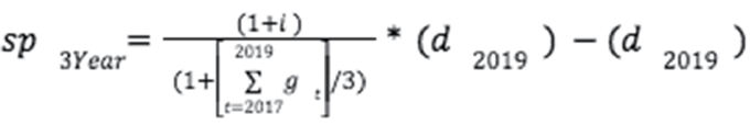
The third main iteration kept the average 3-year growth rates without which we had some illogicalities in the model such as Norway which had among the worst X scores in the 2019 only model, despite their relatively low debt ratio, as a result of their low growth rate in 2019 only. However, their 3 year average growth rate was significantly higher than this single year, determining that this year was more of an exception than the norm of the country’s economic cycle. We refrained from using future GDP forecasts due to the uncertainty around them, although they could potentially be used.
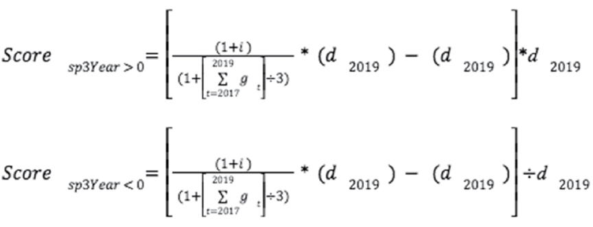
The main improvement of the third iteration was the integration of a score multiplier, depending on the general debt level of the country. We worked off of Sutherland’s previous work determining the marginal efficiency of budgetary spending depending on public debt. Sutherland determines that once public debt reaches a certain level, its Keynesian effects are counterbalanced by a reduction in household consumption. This effect leads to an anti-Keynesian tipping point in public spending beyond which any marginal spending would be counter-productive. For this reason, we decided to adjust the previous Stabilising Primary Balance according to current debt levels to reflect this effect. Therefore, if a country’s debt stabilising primary balance was negative, it would then be multiplied by the country’s public debt as a percentage of GDP, obtaining a score which depends on the general debt level. This score now reflects better that a debt burden growing faster than the growth rate is not a source of concern if these expenditures are temporary or if the current debt level is very low. Inversely, a Stabilising Primary Balance of –1%, for example, indicates less fiscal capacity if a state is heavily indebted as opposed to one with a low public debt balance. For States which need to run a primary surplus to maintain their current debt level, this calculation is inverted, meaning that their stabilising primary balances are divided by their current debt level (in %), therefore increasing the score for higher debt levels, and decreasing the score for lower levels. The formulas for this iteration are as follows:
1.2. Welfare state outcomes formula (Y-Axis)
A composite index is required to assess welfare state outcomes universally. This index would give each country a score and tell different things about its success at reaching its goals as a welfare state. For this second indicator, we took a framework from the OECD society at a glance social indicators report,18 creating the composite indicators to determine the weighting. From the categories from the OECD framework, we divided the policy objectives of welfare states into six: wealth creation, the environment, health, inequalities, labour force participation rate, and education. We attributed scores according to policy goals/indicators from the OECD, giving scores intuitively to the indicators depending on the assessed relevance of each indicator to the policy goal. We then tried different weightings through a modified long matrix, depending on the subjective importance of other objectives to achieve the mean weighting. Using the handbook from the OECD, we decided to use the easiest standardisation method, ranking, to normalise the data. The following indicators were part of the thought process for the creation of Y: GDP per capita (PPP), GINI, social expenditure, debt-to-GDP ratio, risk premium, labour force participation rate, world happiness report, big mac index, genuine progress indicator, gender development index, green GDP, Gross National Well-being, at-risk-of-poverty rate, genuine progress indicator, poverty rate.
Beginning our analysis, we were faced with either attributing each of our chosen indicators an equal weighting to completely remove any individual bias from our model. However, the result would have been a model which would in effect consider that each of the selected indicators is of equal importance to a welfare state. We therefore chose to instead find a way to establish a form of relative importance between each of the indicators as they may appear to policy-makers. In effect, any policy decision, as a result of its economic cost, is a choice to answer a certain policy goal over another. This decision requires comparative and relative analysis.
To identify the relative importance and corresponding weight of each indicator, we derived the multi-criteria decision analysis model from a different field of social sciences: criminology. The methodology in question, SLEIPNIR, is an analytical tool developed by the Royal Canadian Mounted Police to rank and evaluate the threat of organised crime groups to society. The aim of this exercise was to compare and contrast the level of risk presented by various Organised Crime groups, providing an analytical framework to remove a part of human bias. The different Crime Groups are analysed and compared by scoring them intuitively (usually involving multiple analysts) on a scale of 1 to 4, depending on a variety of perspectives such as: their scope, group cohesiveness, expertise and discipline. This then gives the analysts a basis for structured reasoning on the risk these organisations create on the basis of the relative scores. This was used to great effect to prioritise action against certain groups over others. This methodology can be a very effective tool for establishing the relative importance of different indicators in a composite indicator. We can use the same relative ranking tools to establish a structured reasoning framework to pick and choose which indicators to use in the model, by replacing group features with policy objectives, and replacing Organised Crime Groups with indicators. In the same way that the RCMP was able to focus on certain groups over others, we can provide greater structure in developing this index. 19
The first step of this exercise was to evaluate how useful each given indicator was for the goals of evaluating welfare state objectives. This begins according to the SLEIPNIR methodology with an initial direct comparison between all of the possible indicators. This stage involves comparing each indicator to all the others. Each time an indicator is assessed to be more useful in assessing the performance of a welfare state, it is given a point. We then chose the five indicators having most points on the basis of this comparison for the composite model. Carbon Dioxide/Unit of GDP was added for the reasons detailed further on. This way of picking indicators and assessing their relative importance gives us a more logical and rigorous way of developing a composite indicator.
Ultimately, we chose the following indicators for the model: Gini, Carbon Dioxide/Unit of GDP, Labour Force Participation Rate, The Education Index, Average Wage PPP, and the Life Expectancy Index. These five indicators (Carbon Dioxide excepted) combined cover and provide some measure of a state’s performance on the 25 objectives of a Welfare State as set out by the OECD.20 In our analysis, we only kept 19 of them as some had considerable overlap, for example, Employment and Unemployment, which broadly correspond to the same objective.
Carbon Dioxide/Unit of GDP is an unconventional indicator in the study of social policy, however, we found it was important to integrate it into the index. It may not directly reflect traditional welfare state outcomes. However, given the global environmental challenges ahead, welfare state outcomes should not and cannot be increased at the expense of the environment, lest it should only worsen welfare state outcomes in the future. Therefore, it is necessary to take into account the ecological cost of welfare state outcomes.
We then rated these according to how well they represented the different policy goals determined by the OECD, the idea being that one of these indicators will be correlated with more than one policy goal, more or less strongly. For example, the Gini Indicator is not a measure of corruption in a country, however, it is correlated with low corruption (as well as lower crime and lower regional inequality). The indicators were thus picked as precursors of other policy goals, encompassing more than one dimension through correlation.
The long matrix: To determine just how the indicators are stacked up against each other in assessing each policy goal and subsequently how important they are (the labour force participation rate is correlated with many more policy goals and is more structurally significant than Carbon Dioxide/Unit of GDP, it is, therefore, necessary to weight these two differently in assessing the quality of a welfare state’s outcomes) we listed the policy goals and attributed a score from 1 to 4 (4 being the highest). In our model, the score of 4 was attributed to an indicator if it represented a direct or near-direct measure of the policy goal in question. The scores of 2 and 3 were attributed in case of high relevance but lack of an obvious causal relationship between the indicator and policy goal. The score of 1 was attributed in case of low relevance or high variance in the correlation between the indicator and policy goal.
_lent_fmt.png)
We then compared the sums of the indicators and applied a degressive weighting on each policy goal depending on importance to evaluate the robustness of the sums. Each successive weighting gave us a slightly different score, depending on the difference between the heaviest (most important) policy goals and the lightest ones. The life expectancy index, for example, was found to be relatively overweight initially as it answered several policy goals which were ranked lower.
_lent_fmt1.png)
The final weightings we used for each indicator are as follows:
_lent_fmt2.png)
Indicator:
To determine each country’s score for the composite weighted version of the Y indicator, we used a simple ranking method, from worst (1) to best (31). We then calculated the weighted sum of this ranking score based on the previously attributed weightings.
Formula for Y
_lent_fmt3.png)
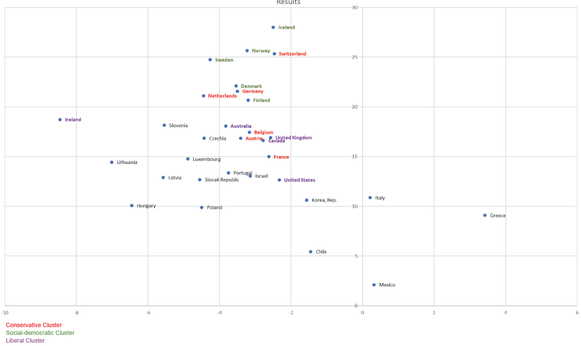
We created a scattergram after doing the X and Y formulas, placing countries based on their scores. Countries with the lowest X (on the left) have the most financial capacity, and countries with the highest Y (on top) have the best welfare state outcomes. Countries with a positive X (on the right) do not have any fiscal capacity, and one could argue that they are not in an excellent position to launch new social programs. It is, of course, up to the reader to analyse and come up to conclusions. As another example, countries with both low X and low Y are in a situation where they could potentially and logically be advised to launch new social programs, as they have the financial means to do so. The scattergram is visible in the following part, under the analysis of results.
2. Results
We went through multiple iterations of this model, keeping the same composite indicator but adjusting the formula to evaluate the fiscal capacity on the way. The results presented below are those of the final iteration. The final iteration compares the debt-stabilising primary balance calculated using a GDP Compound Annual Growth Rate of 3 years. The assumption is that future growth is more likely to resemble average past growth than past year growth. This figure is then adjusted depending on the debt level in the country, as detailed previously.
Using this model and analysing its output, we can suppose that certain countries could be better positioned for further social spending. These welfare states have a combination of low debt, high growth, and low public deficit (or, in some cases, a comfortable surplus). We contrast this with these states’ composite welfare state performance to see how they compare to others. The model would suggest four general classifications of countries. Firstly, we could group countries in the bottom left of the scattergram together as those with few fiscal constraints and relative underperformance in terms of welfare state outcomes compared to other OECD countries. These countries are Lithuania, Latvia, and Hungary. In the bottom right quadrant, we can see those countries, which have fiscal constraints, but are still relative underperformers in terms of welfare state outcomes. This could be the result of either inefficiencies, other state priorities (for example, military spending instead of welfare), poor government spending policy in the past, or macroeconomic difficulties, for example. These countries include: the United States of America, Korea, Italy, Greece, and Chile. The top right quadrant are the countries which are relative overperformers in terms of welfare state outcomes, but which do not have excess fiscal capacity, these should be the states which did things “well”, which invested in social development, and now have best-in-class outcomes, but as a result do not have much room for extra spending. These are countries such as the Northern European ones (Social-Democratic typology), Switzerland, Germany, and the Netherlands. The top left quadrant are what should be “unicorns”, countries with best-in-class welfare state outcomes, as well as fiscal capacity left over. Ireland is the only country which comes close to being in this category. Beyond this general categorisation, we can also carry out a more granular analysis of certain groups of countries on the basis of these results, by comparing how different countries fare.
One way to divide the countries is to put them into clusters based on their welfare state typology. When looking at these different typology-based clusters, the Social-Democratic one stands out clearly. All countries of the Social-Democratic typology have far-above-average welfare state outcomes according to this model. In contrast, they seem to have less room for welfare spending expansion due to limited fiscal capacity. Out of the five best-performing countries in terms of welfare state outcomes in this methodology, four have public social spending of around 25% of GDP or above. It is important to note, however, that some very high-performing states, such as Iceland and the Netherlands, have lower than average public social spending at around 16–18% of GDP.21 This last point is, however, also to be contrasted with the fact that the Netherlands has historically had much higher social spending of around 25%, and their current total net social spending is one of the highest in the EU at 26% as a result of their semi-privatised system. Iceland does remain an exception with historically low social spending and best-in-class welfare state outcomes.
A particularly apt example among results is Lithuania which presents suitable characteristics for expansionary social policies, including high growth and low debt. Furthermore, it is one of the less developed countries in the scattergram. Interestingly this also coincides with Lithuania’s strikingly low public welfare spending of 16.2% of GDP compared to the EU’s average of 28%.22 Hungary provides a similar example, although with higher debt levels but similar macroeconomic trends and social spending figures.
3. Discussion
The scattergram considers current debt levels. It applies a multiplier to take into account the negative impact of high debt on the efficacy of public spending and the higher risks associated with high debt. When looking at the results on the scattergram, we can see that countries that succeed the most on welfare state outcomes tend to have less room for marginal spending according to the index and, coincidentally, are countries with higher government spending levels. This is the case for Northern European countries, for instance. Countries with lower levels of debt, and thus potentially lower levels of public spending, tend to have lower welfare state outcomes, which makes sense. Countries that fit in the typology tend to have similar welfare state outcomes. The Scandinavian welfare states do, and it is also logical. On the other hand, Lithuania, for instance, has more room for extra spending, thanks to its low debt and strong economic cycle from 2017 to 2019, while its welfare state outcomes are far from perfect. The same goes for Ireland. This result does not explain what they should do, but we know that their government has less financial constraint if they decide to work on their welfare state outcomes. The combination used in this scattergram is interesting because it could be seen as somewhat of a dilemma for welfare states. Welfare states with lots of development potential often lag on welfare state outcomes, and countries doing well on outcomes tend not to have much room for further development.
The Welfare State Scattergram allows for all countries to be analysed, as it is only based on universal indicators. It does not depend on the type of welfare state in which those countries would be classified. The ambition behind creating this scattergram based on two indices is to give a snapshot of a given moment, not an analysis. The scattergram shows both the economic constraints and welfare state outcomes. The economic constraints can also be seen as expansion potential, and they are measured through an index that is a proxy of fiscal capacity. When using the Welfare State Scattergram, the analysis is to be made by the person using the index based on his/her choice of theories and ideological beliefs. This index could, for example, help predict if a country is ready to implement new and expensive universal social programs. On the other hand, it can also show that a country has, for instance, built its welfare systems in a non-sustainable way. The Welfare State Scattergram shows a different combination of data than existing composite indices.
This study brings to light inefficiencies or, at the very least, differences in the efficacy of government spending among the countries covered. Countries with both low adequacy for supplementary welfare spending and worse welfare state outcomes can therefore be defined as either governments whose aims are not primarily welfare state outcomes or countries that are inefficient at allocating social spending best (or, yet again, countries that might have had exogenous shocks unrelated to their social spending, limiting their ability for such programs). Some clusters are also visible on the scattergram for welfare state regimes but not for all of them. Social-Democratic welfare states are close on the scattergram, meaning that their fiscal capacity and welfare state outcomes are similar. Latin Rim welfare states tend to score similarly on welfare state outcomes, but their fiscal capacity varies greatly. Despite some of them being close to each other on the scattergram, there is no clear cluster for Liberal and Conservative welfare states. Even though there is a cluster for most types of welfare states, most clusters are only partial because we do not look at the same criteria as qualitative typologies. We find a way to quantify two factors that assess welfare states. It is not surprising because the index is more outcome-focused and less process-focused than qualitative welfare state typologies are. The index also solves the issue of geographics. Welfare State typologies such as Esping-Andersen’s have difficulty placing non-Western countries. As an example, the case of Asian countries is complex.
However, there are several limitations to this index. First, it only looks at a snapshot of the situation at a given time. It also assumes that current public debt to GDP is optimal. For the case of low-debt countries, the low level of debt can make the country’s situation on X look better than it is in reality, as having low levels of debt does not necessarily mean that the country is in the right position for increased social spending. Some countries might have a bad score on X because of high debt while still having more room for spending than countries that score better on X because tipping points are not the same for every country. The multiplicator allowed to eradicate a part of this issue, although it is applied equally to all countries. A different variant of this multiplier could be designed to take into account differentiated debt thresholds dependent on economic development as explained by Caner et al. in 2010. However, we do also wish to highlight the fact that this tipping point is not necessarily the point at which sovereign debt becomes unsustainable, but the point at which each marginal point of debt/GDP begins slowing down economic growth significantly. For this reason, this index does not define when extra government spending is desirable or not, but the adequacy of welfare state expansions or sweeping social spending programs. This index is also based on mainstream economic views, not taking certain widely accepted and interesting economic theories into account. Advocates of Keynesian theory, and even more those of Modern Monetary Theory, would likely argue that having specific amounts of debt does not necessarily mean that more should not be spent, depending on the situation. However, this does not make the index and scattergram less valuable, even for them, as this index only aims to give a snapshot of the welfare state’s situation at a given time. The decision on what to do with the results based on that snapshot is up to the reader. It is also important to remember that composite indices do not give more information than the single indices they are made of. A composite index just presents the information differently. It should be seen as simplistic presentations and comparisons of performance in given areas to be used as starting points for further analysis and discussion.23
One advantage of this methodology, namely its equal treatment of all countries, is also a disadvantage in that it does not account for qualitative or country-specific differences in fiscal policy and effectiveness. Any given country might have a far lower tipping point, or higher monetary velocity leading to different fiscal effectiveness dynamics. A second limitation to this methodology is that it does not give a direct recommendation as to optimal fiscal policy or distribution of spending. It is solely meant as a comparative tool upon which further analysis can then be built. Building upon limitation number one, it is important to realise that there are a multitude of historical, political, geographical, demographic, and economic factors which cannot reasonably be used in such a comparative analysis. The impacts played by the market, civil society and the family as an institution are not directly taken into account. Therefore, this indicator, like any other, can only be used in a broader more complete analysis and not in a vacuum. An operational limit of this methodology is its time sensitivity: Fiscal and welfare policies are built and designed for the next several decades and rely on more general macroeconomic trends and future potential (and real) economic output, as well as other demographic variables. The current model uses a 3-year-average growth as a comparison point to evaluate future policies, however if one were to use this ratio to evaluate future suitability of additional welfare policies, other variables could be used to evaluate future growth instead of past. A final operational limitation of this model is the unique and country-specific structure of spending, tax income, and public debt. OECD and UN data are used to make sure that these figures are directly comparable and workable. However, differences in state operations could still subsist and lead to an unequal comparison.
Conclusions
The contribution of this paper is useful for the field of social policy because the Welfare State Scattergram gives an easily readable and precise scattergram that allows us to analyse and compare current welfare state outcomes and fiscal capacity. This model is not final and can be modified if needed. The weightings and choice of indicators involved in the indices are not definite. However, the idea of having welfare state outcomes and fiscal capacity combined is the main novelty of this new tool. It brings something to the table that existing indices and typologies do not. Its goal is not to replace existing tools but to complement them. The scattergram shows that welfare states’ outcomes and fiscal capacity can be identified. Using a scattergram provides a cartographic depiction of welfare states relative to one another based on solid and universal parameters. An approximation of a welfare state’s fiscal capacity can be compared (and thus development potential) through a formula taking into account necessary macroeconomic variables (interest rates, growth, inflation, debt levels) all the while taking out of account others (linked with exchange rate dynamics, proportionality, and purchasing power) with a general appreciation of welfare state outcomes as defined by OECD priorities. Of course, multiple tweaks could be performed on this index. The OECD Better Life Index shows that there is no perfect weighting for composite indices that measure welfare state outcomes. The importance that people assign to different topics that create the outcome is somewhat subjective. Still, the Welfare State Scattergram provides a valuable first look into indicators characterising welfare states relying on simple, comparable, and universal parameters. Secondly, one of the leading innovations is a methodological one. While creating this index, a modified Sleipnir matrix method was used to determine the relative importance and impact of different indicators according to an analytical framework. Using an equal weighting of all the indicators we wished to integrate to answer the greatest variety of policy goals would not have provided an adequate picture of welfare state outcomes or would not have reflected how broad each indicator was (Labour force participation rate is correlated with far more policy goals than CO2/unit of GDP). The successive sensitivity check using linear matrices could also establish no significant variance in relative importance. While some subjectivity is involved in the formula creation process, the SLEIPNIR methodology is a helpful tool in limiting the level of bias.
In conclusion, this newly created scattergram has clear limitations. It would be arrogant to claim that this model, choice of indicators, or weightings are perfect. Despite our satisfaction with this original idea and its final version, there is still space for further research and work on this index. This indicator only analyses the situation at a given time, and, as stated in the previous part, several other limitations exist. Furthermore, social spending has a differentiated impact in any given country due to a multitude of qualitative and quantitative factors ranging from history and geography to the velocity of money. These differences could be accounted for by integrating other variables in the formula at the cost of the initial formula’s simplicity. The tipping point on public debt levels is not the same for developing and developed countries. Further research could be done to improve the indicators that have been created for this paper. Sutherland’s formula could potentially be integrated into the formula for the fiscal capacity estimate (X) to address this issue. It is clear that after reaching a certain level of public debt, the desired effect of expansionary fiscal policies decreases. The fact that the optimal level of public debt is different for each country could be incorporated in X. For Y, the weighting of indicators can be discussed, and different indicators could be included. This would lead to slightly different results but the overarching idea of studying social outcomes and economic capacity on a single cartography remains the same. This article is a first attempt to compare and study welfare states from an economic point of view in this manner. Finally, the countries on the scattergram were put into clusters. One of the aims of this index consisted of developing a universal measure to complete subjective qualitative typologies and thus to avoid having to place countries into categories. However, clusters of countries with similar results could be created. One cluster could, for instance, consist of countries with high welfare state outcomes and low fiscal capacity. In contrast, another cluster could consist of countries with low welfare state outcomes and high fiscal capacity. It is up to the people using the index to use it creatively.
Bibliography
Badiuzzaman, Bergougui, Brahim Bergougui, Syed Mansoob Murshed, and Mohammad Habibullah Pulok. “Fiscal Capacity, Democratic Institutions and Social Welfare Outcomes in Developing Countries.” Defense and Peace Economics (June 2022): 1–26. https://doi.org/10.1080/10242694.2020.1817259.
Bracanti, Cesira Urzì. Measuring State Effectiveness: An ILC-UK Index. London, UK: The International Longevity Centre, 2016.
Britannica. “Welfare State.” Accessed February 17, 2023. https://www.britannica.com/topic/welfare-state.
Caner, Mehmet, Thomas Grennes, and Fritzi Koehler-Geib. “Finding the Tipping Point – When Sovereign Debt Turns Bad.” SSRN (November 2010): 1–17. https://doi.org/10.1596/1813-9450-5391.
Castles Francis, Stephan Leibfried, Jane Lewis, Herbert Obinger, and Christopher Pierson. The Oxford Handbook of the Welfare State. Oxford University Press, 2010.
Haile, Fiseha, and Miguel Niño-Zarazúa. “Does Social Spending Improve Welfare in Low-income and Middle-income Countries?” Journal of International Development 30, no. 8 (October 2017): 1–32. https://doi.org/10.1002/jid.3326.
Investopedia. “Fiscal Capacity.” Accessed June 7, 2022. https://www.investopedia.com/terms/f/fiscalcapacity.asp.
OECD. “Social Expenditure.” Accessed November 2, 2021. https://www.oecd.org/social/expenditure.htm.
OECD Library. “Society at a Glance 2019.” Accessed November 3, 2021. https://www.oecd-ilibrary.org/social-issues-migration-health/society-at-a-glance-2019_soc_glance-2019-en;jsessionid=E9zX45Exd8dL6AW3JACSAkJO.ip-10-240-5-175.
OECD. “OECD Better Life Index.” Accessed December 2, 2022. https://www.oecdbetterlifeindex.org/#/12111121111.
OECD. “Inequality.” Accessed March 12, 2022. https://www.oecd.org/social/inequality.htm/.
Pichon, Eric, Agnieszka Widuto, Alina Dobreva, and Liselotte Jensen. Ten Composite Indices for Policy-Making. PE 696.203. Brussels, Belgium: European Parliamentary Research Service, September 2021. 1–21. https://www.doi.org/10.2861/774077.
Prasetyo, Ahmad Danu and Ubaidillah Zuhdi. “The Government Expenditure Efficiency towards the Human Development.” Procedia Economics and Finance 5, no. 1 (September 2013): 615–622. https://doi.org/10.1016/S2212-5671(13)00072-5.
Royal Canadian Mounted Police. SLEIPNIR, the long matrix for organized crime : an analytical technique for detecting relative levels of threat posed by organized crime groups. Royal Canadian Mounted Police, 2000.
Saisana, Michaela. “Composite Indicators: A Review.” In Second Workshop on Composite Indicators of Country Performance, 1–29. Paris, France: OECD, February 2004.
Statista. “National Debt of the European Union and the Euro Area in Relation to the Gross Domestic Product (GDP) from 2017 to 2027.” Accessed October 14, 2022. https://www.statista.com/statistics/253616/national-debt-of-the-eu-and-the-euro-area-in-relation-to-the-gdp/.
Sutherland, Alan. “Fiscal Crises and Aggregate Demand: Can High Public Debt reverse the Effects of Fiscal Policy?” Journal of Public Economics 65, no. 2 (1997): 147–162. https://doi.org/10.1016/S0047-2727(97)00027-3.
1
2
3
4
5
6
7
8
9
10
11
12
13
14
15
16
17
18
19
20
21
22
23